Case Study
Jazera
Building on Legacy. Designed for the Future.


A Total Rebrand for One of Saudi Arabia’s Infrastructure Pioneers
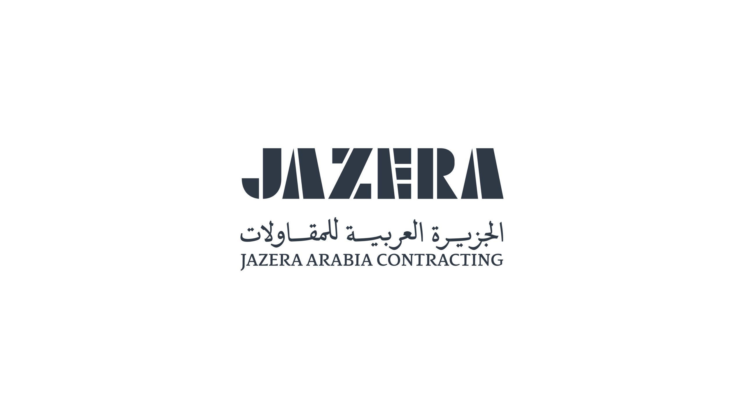
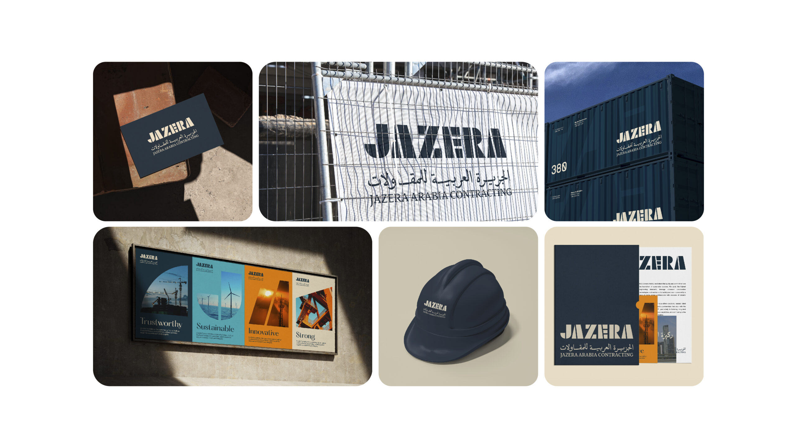
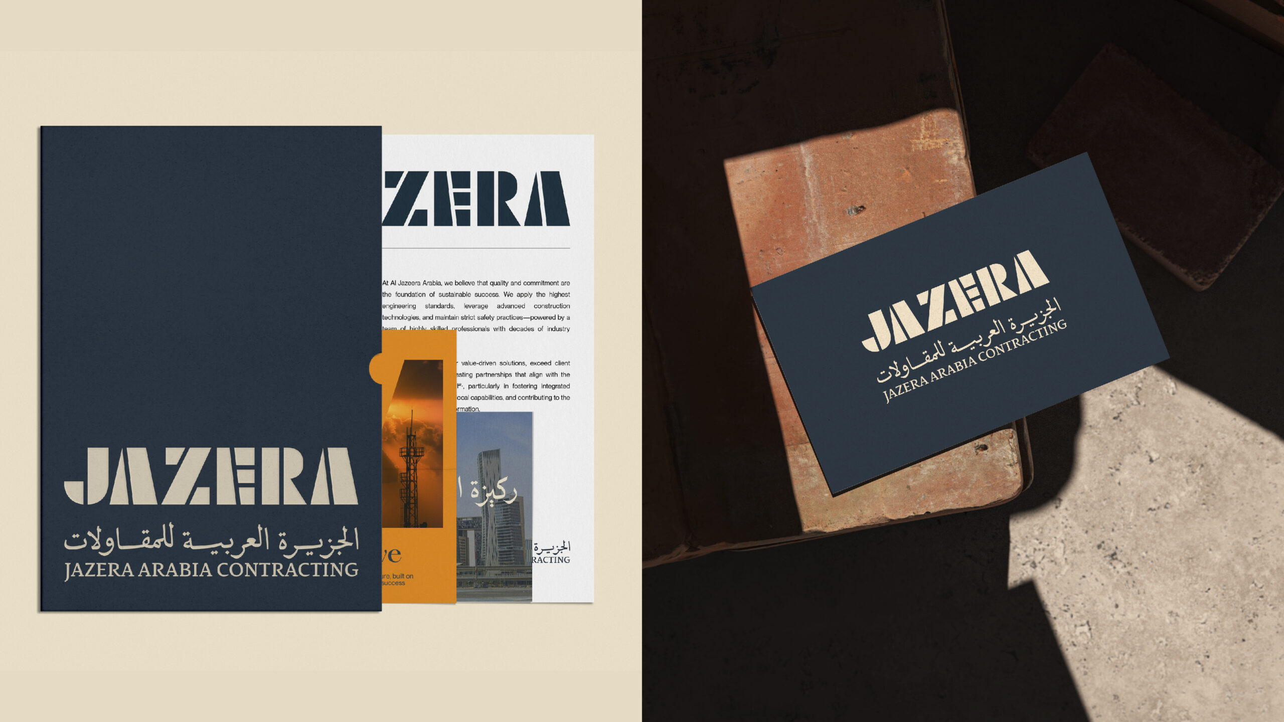
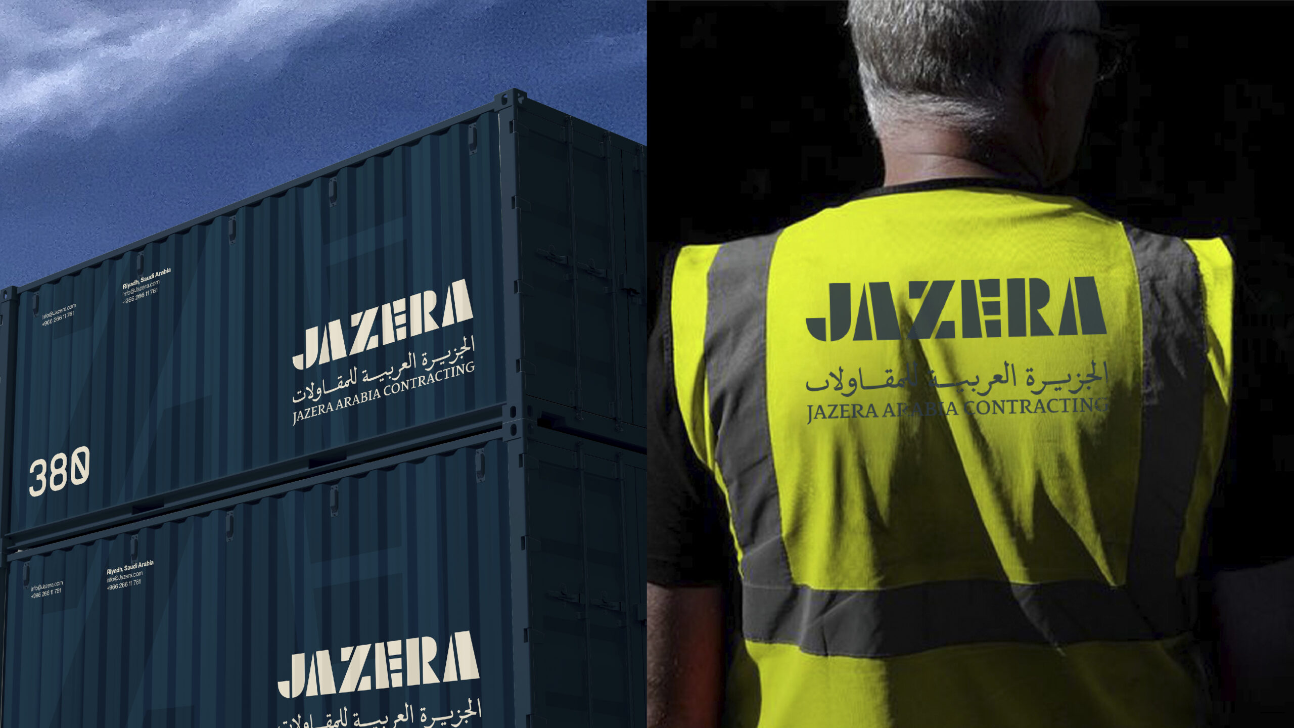
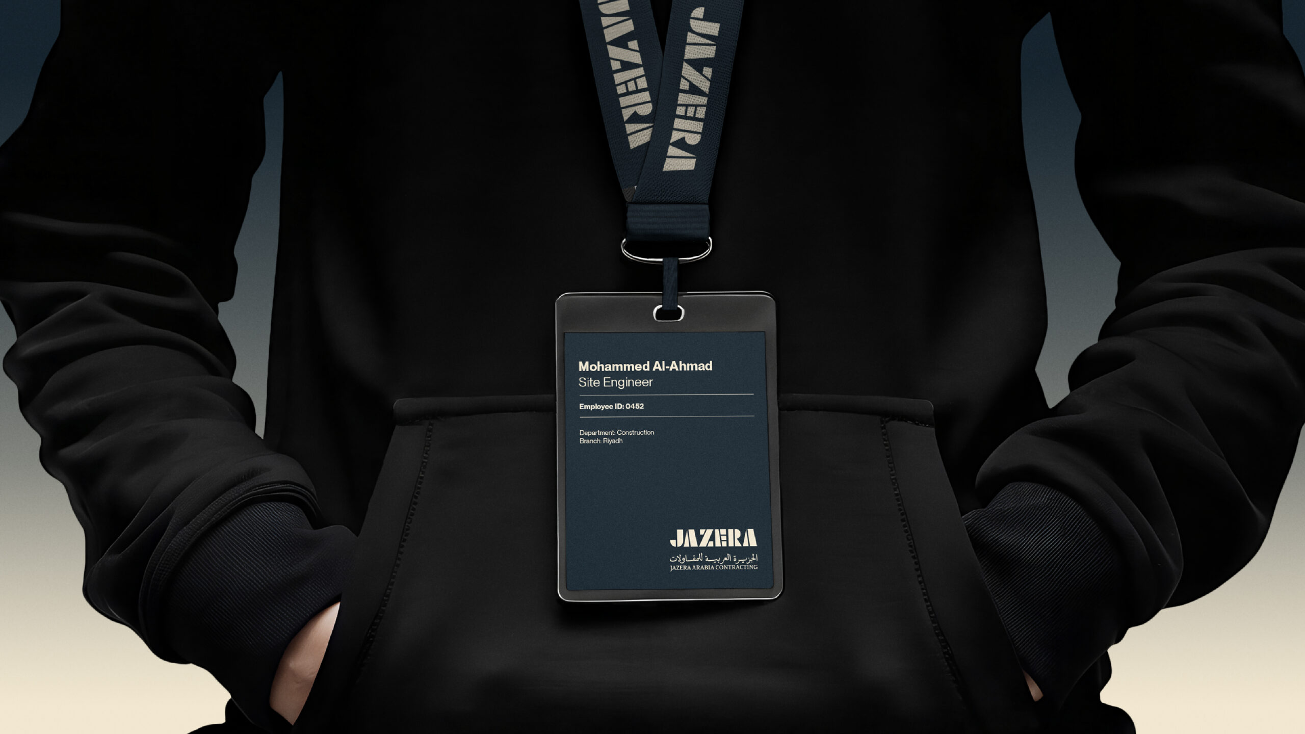
We crafted a full identity transformation grounded in the idea of engineered clarity. The wordmark is inspired by architecture and modular construction, evoking stability and forward momentum.
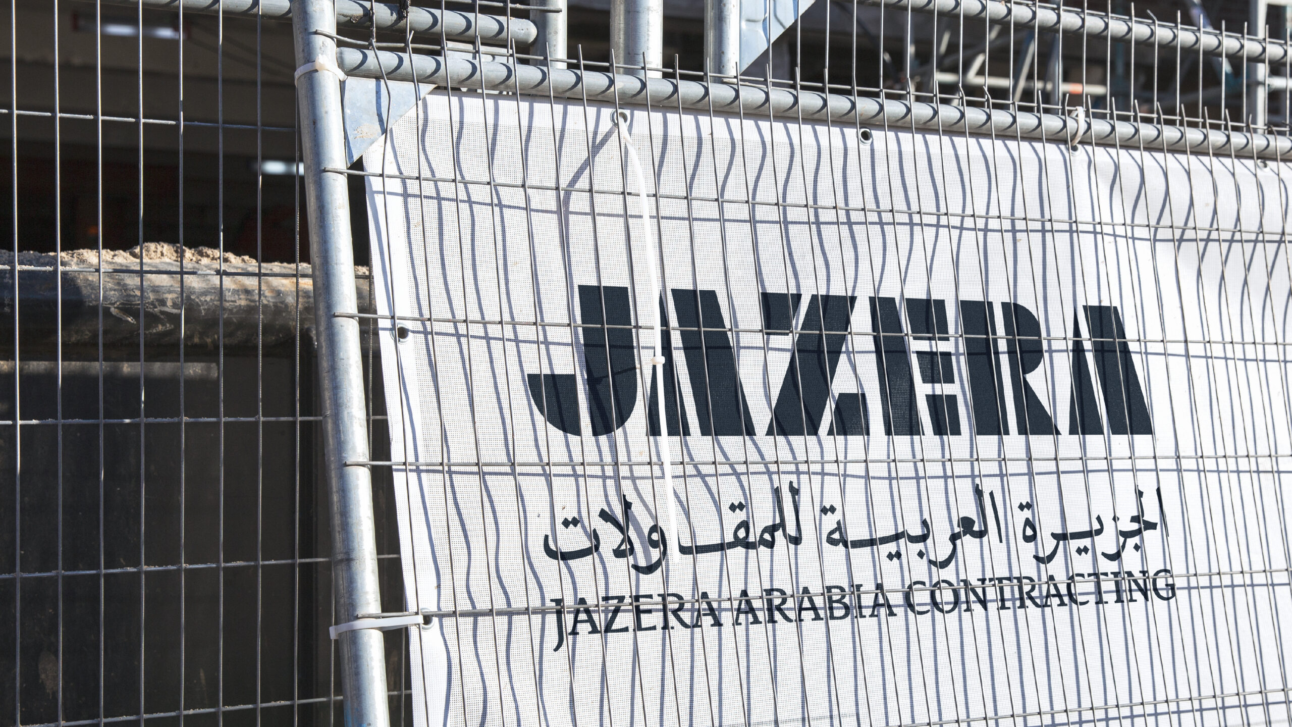
The bilingual lockup gave equal weight to Arabic and English, creating a strong national and international presence.
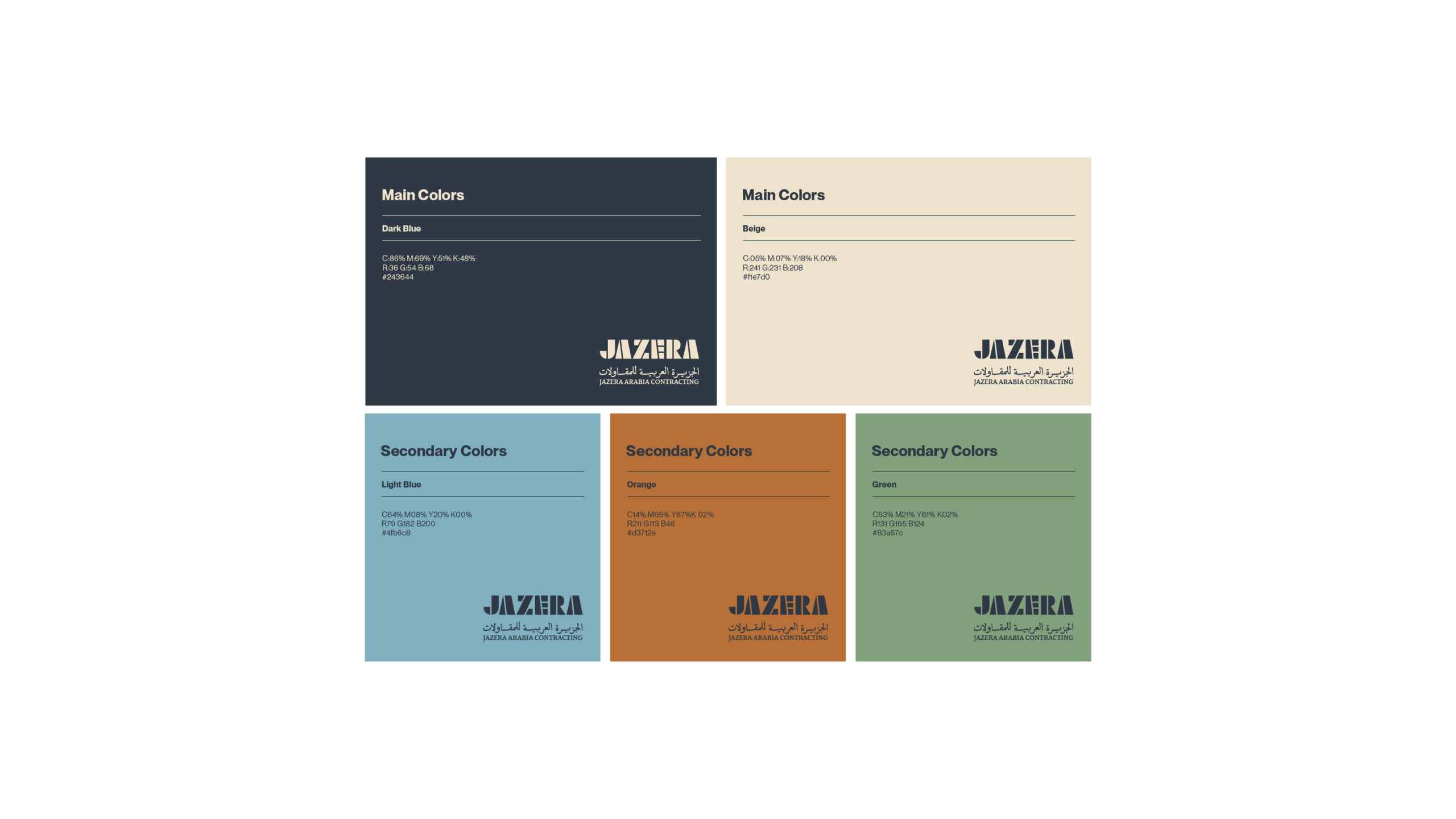
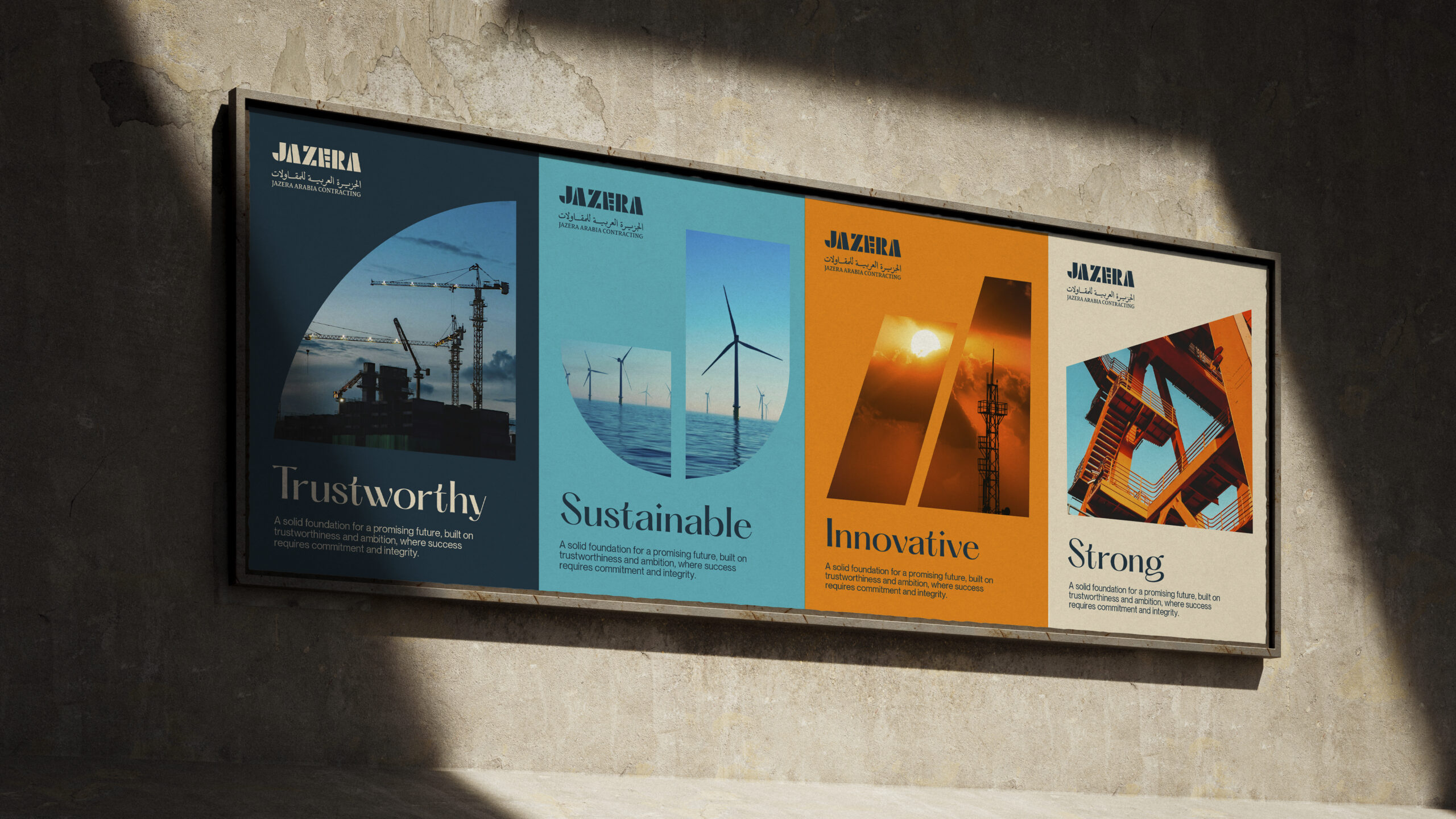
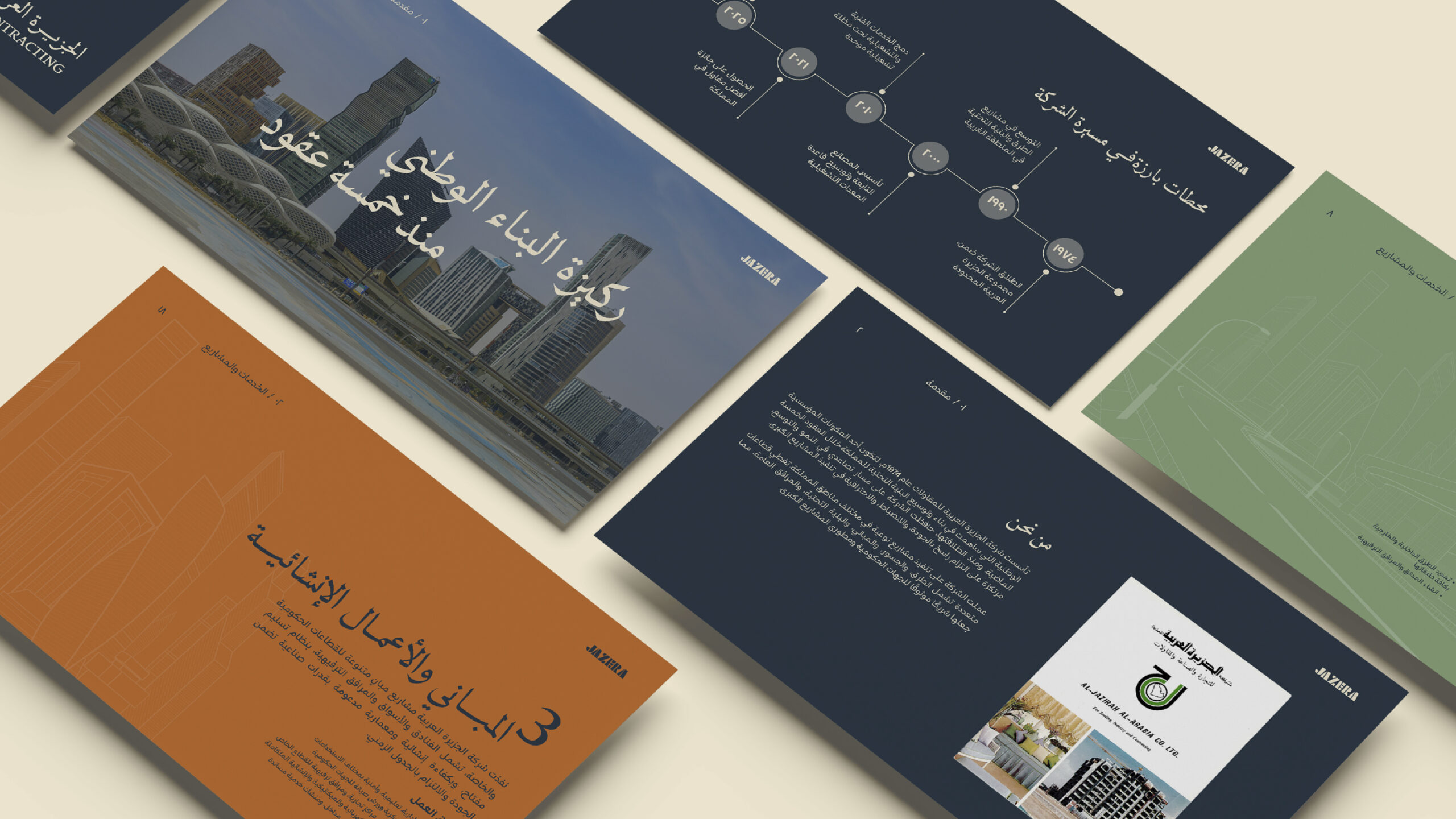
The color palette was carefully curated to balance heritage and modernity: Dark Blue and Beige as the corporate base, supported by energetic accent colors (Orange, Green, Light Blue) that bring flexibility and vibrancy across categories like sustainability, engineering, and innovation.

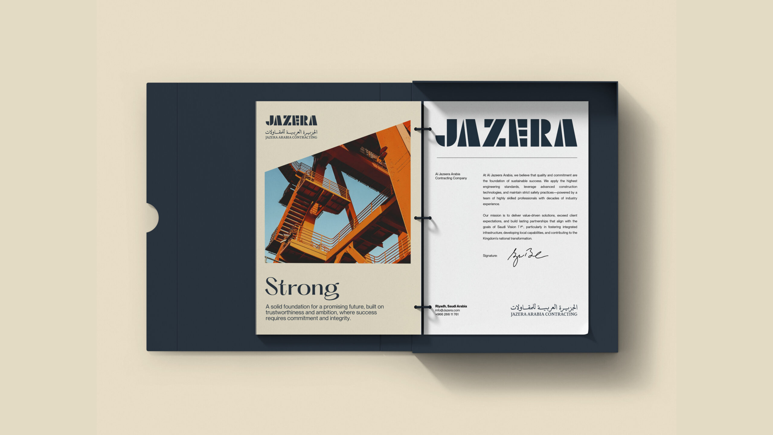
To support a consistent and expandable system, we extracted geometric shapes directly from the logo’s stencil forms and repurposed them into a bold graphic language. These forms became recurring visual elements across posters, signage, and brand communications bringing unity, rhythm, and flexibility to the design system.18
Typography was chosen to support a refined yet industrial tone: creating a contemporary, legible system that stands out in both formal and on-site applications.

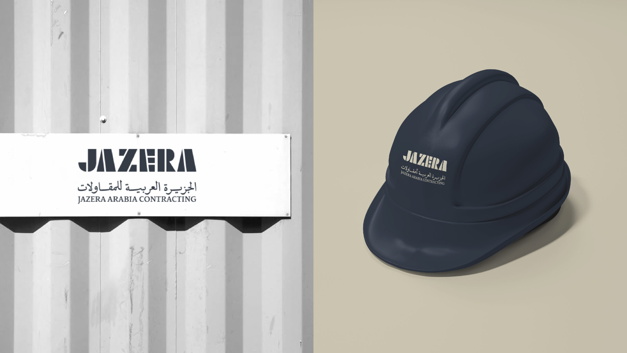
The total rebrand repositioned Jazera as a confident, future-ready national player. Internally, the brand unified teams with a renewed sense of identity. Externally, it presented Jazera as a modern, credible, and ambitious contractor aligned with Vision 2030 priorities.
The visual language now reflects the company’s strength and innovation—built not just for today’s projects, but for the nation’s future infrastructure.
Custom
Brand
Labs.
Get a tailored service and workshop
designed for your specific work culture.

©2022 Chemistry,
a proud part of Suheil Group.