Case Study

LFT

Branding Freshness, Serving Fun.
 

Lft-OpenFile-01
Issue
LFT, a new neighborhood salad and juice bar in Riyadh, aimed to create a strong and distinctive brand identity that would resonate with Gen Z. The challenge was to develop a brand that emphasized health, freshness, and fun while standing out in a competitive market.
Insight
To capture the attention of the Gen Z demographic, LFT needed a brand identity that was vibrant, engaging, and reflective of a youthful, healthy lifestyle. The brand had to be visually appealing and create a cohesive experience across all touchpoints, from in-store design to digital presence. Additionally, the brand needed a verbal identity that would connect with Gen Z through trendy sayings and food-related wordings.
Solution
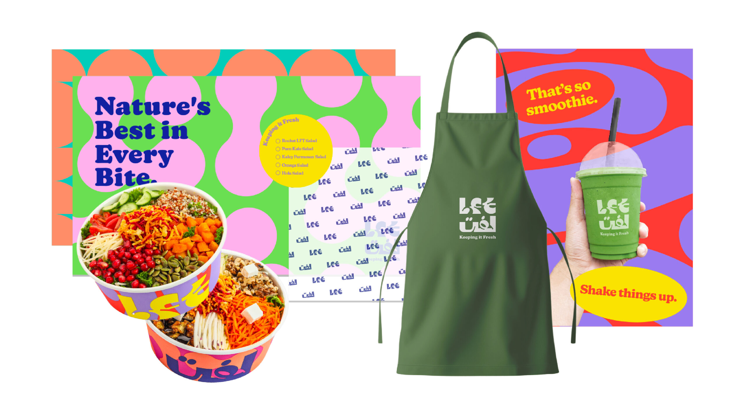
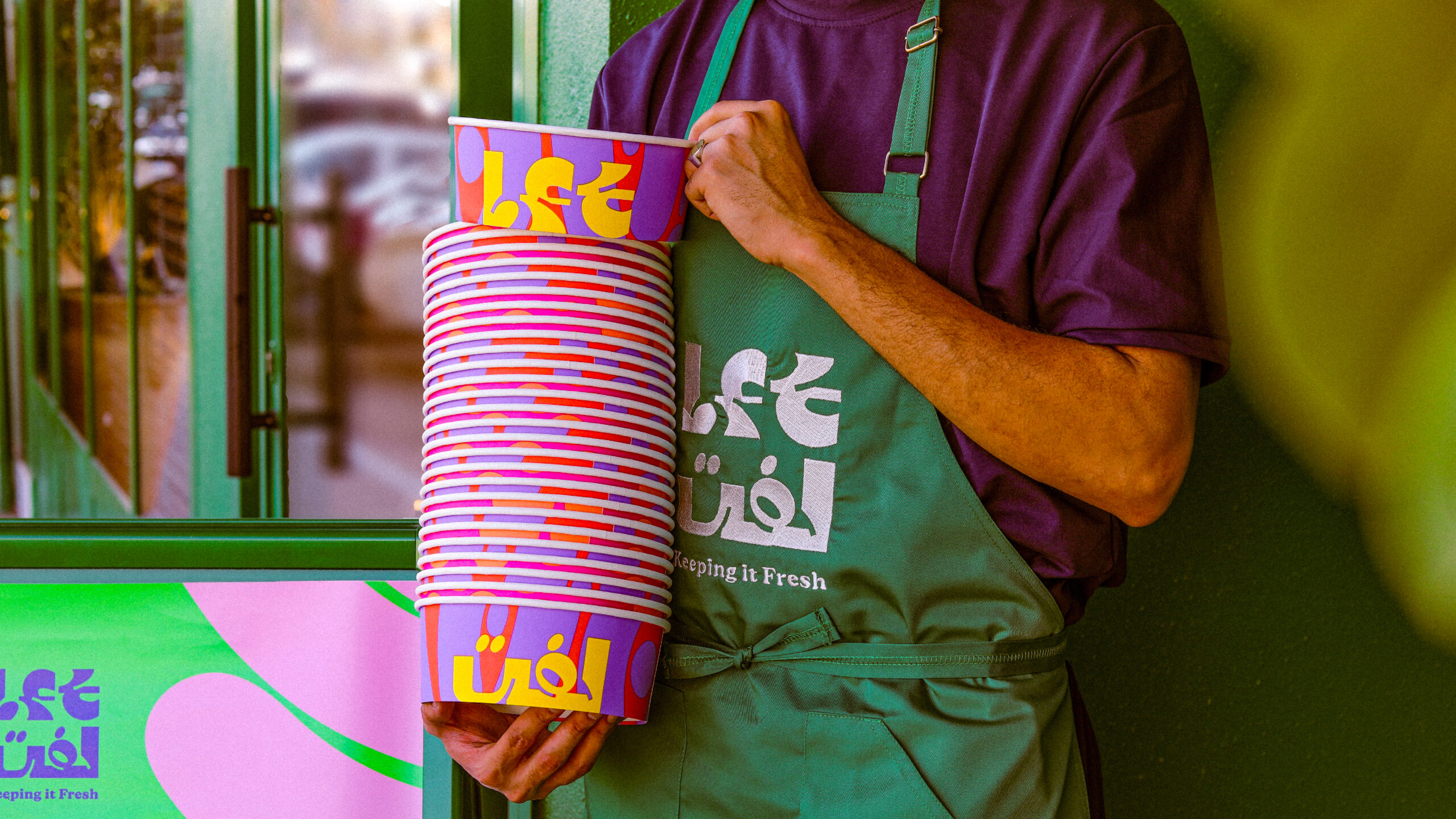
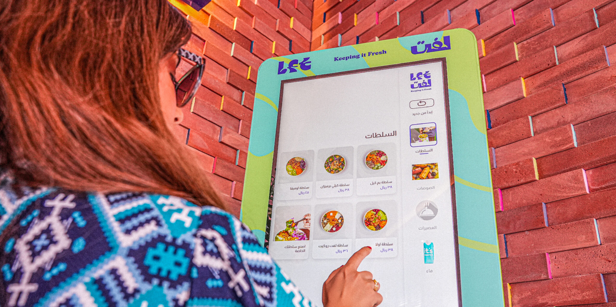
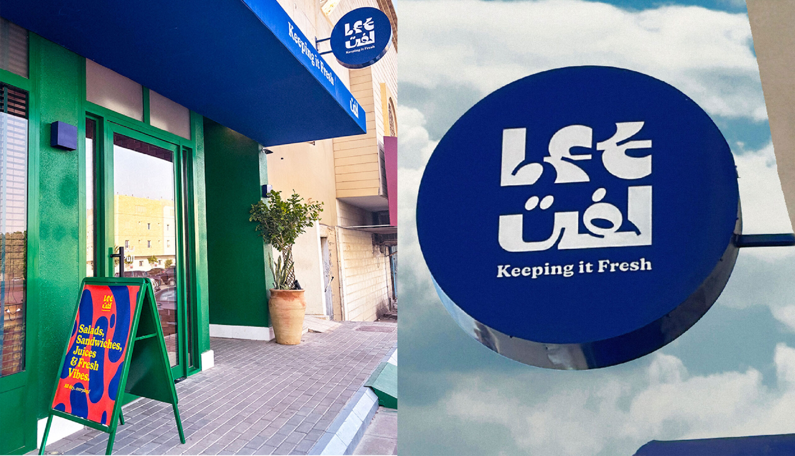
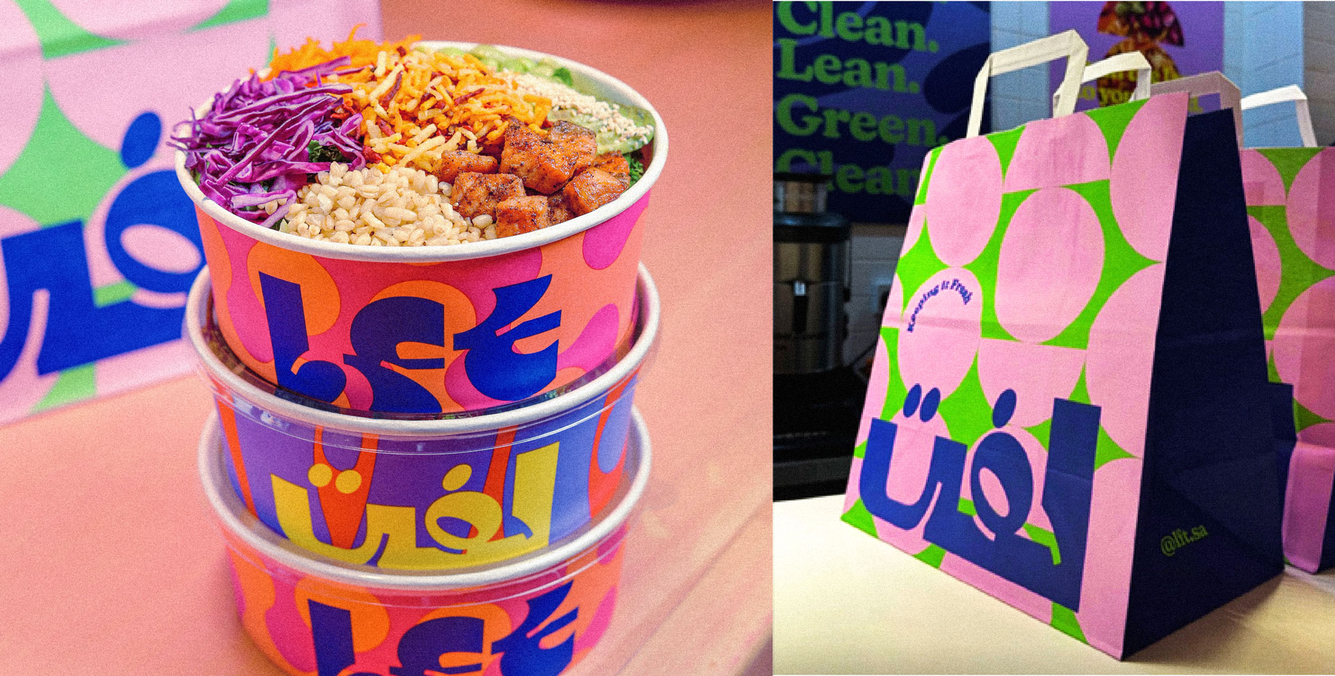
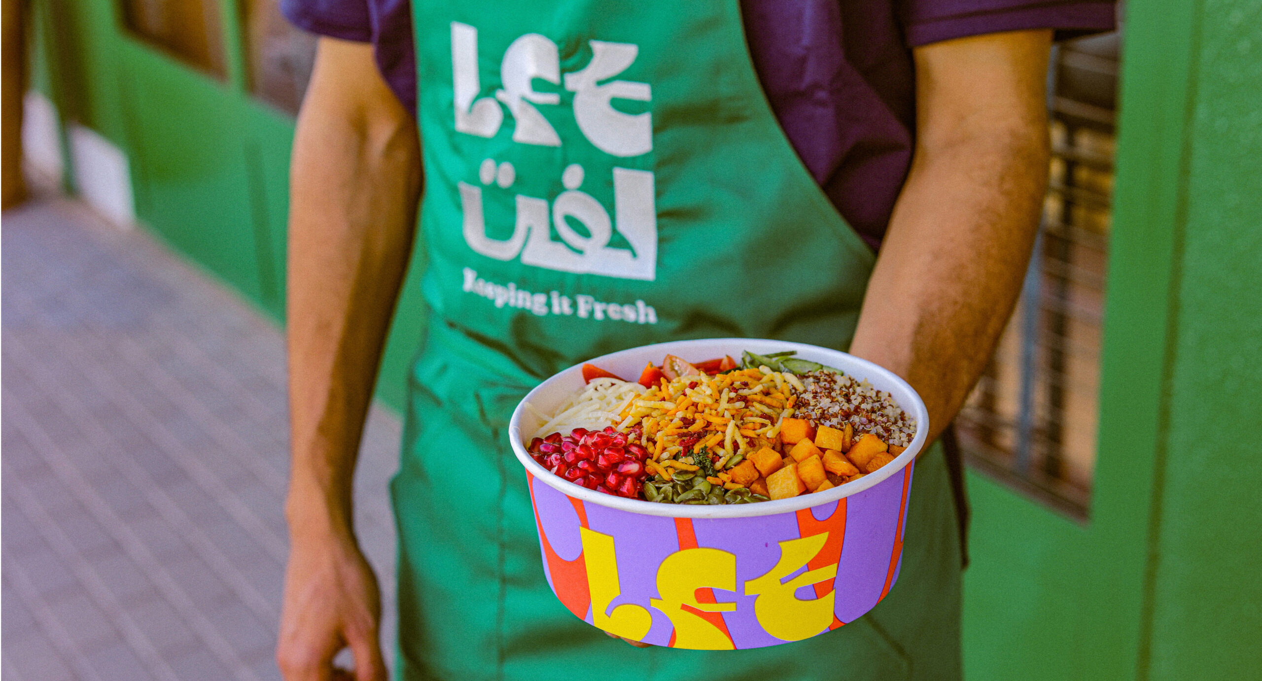
From concept to creation, we meticulously crafted a fresh and vibrant brand identity for LFT. We developed a logo with bold, playful typography and a vibrant color palette to appeal to Gen Z. Dynamic patterns with organic shapes and eye-catching packaging designs ensured LFT’s products stood out. The interior design reflected the brand's values using bright colors and eco-friendly materials, creating an inviting atmosphere.
 
From the catchy tagline ‘Keeping It Fresh’ to the unique positioning, brand identity, packaging design, color palette, interior branding, and menu design, every element reflects our commitment to freshness and quality.
Lft-OpenFile

Crafting a fresh and fun salad bar for Gen Z.
Lft-OpenFile

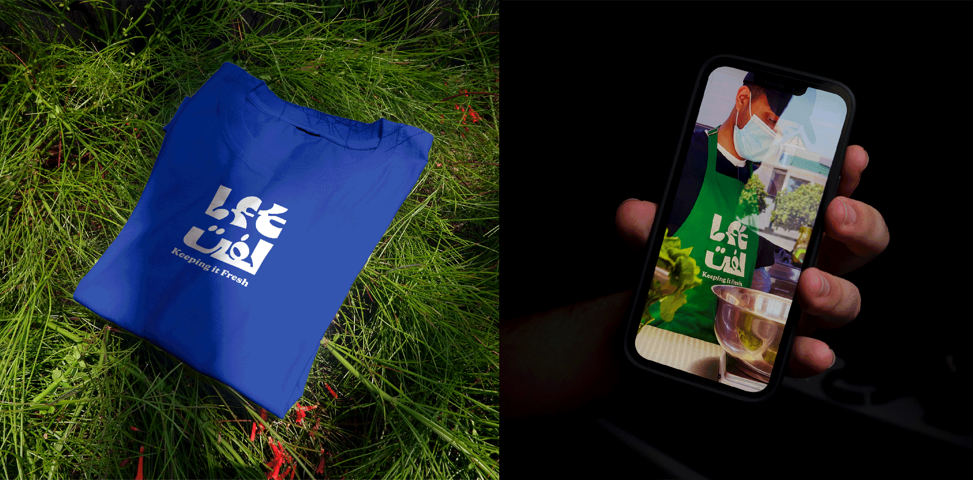
The branding process started with understanding the preferences and lifestyle of Gen Z. The logo, featuring bold, playful typography, was designed to be instantly recognizable and appealing. 

Lft-OpenFile

The choice of vibrant colors symbolized energy and freshness, aligning with the brand’s focus on health and fun.

Gif-Pattern-3

The dynamic patterns with organic shapes drew inspiration from fresh produce and the lively atmosphere of a juice bar. These patterns were used across various brand assets to add visual interest and excitement.
Lft-OpenFile
Lft-OpenFile-10-4

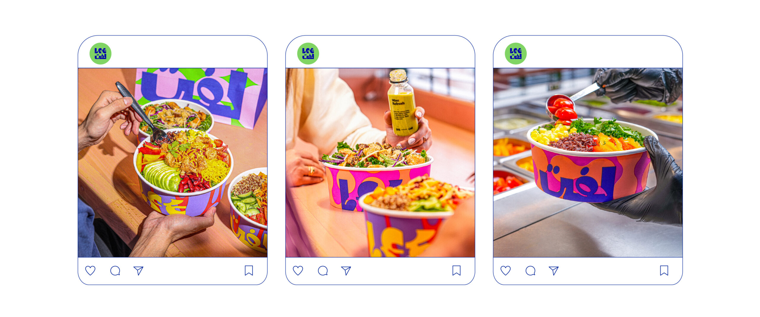
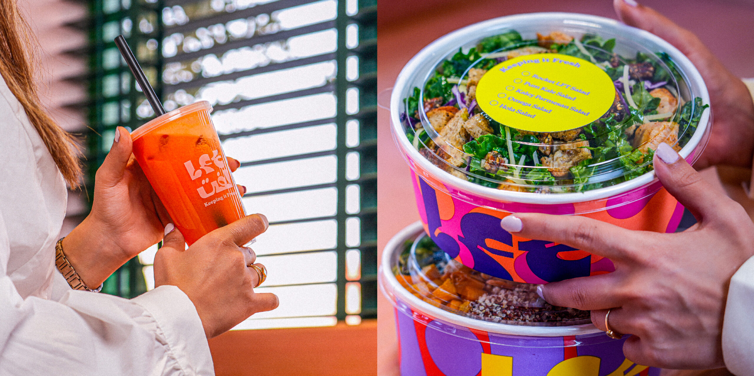
The packaging design was crafted to be vibrant and eye-catching, ensuring that LFT’s products stood out on shelves and conveyed a story of quality and freshness.
Lft-OpenFile-09

The interior design of LFT’s store was a key element in creating a cohesive brand experience. Bright colors and playful patterns adorned the walls, creating a lively and inviting atmosphere that encouraged customers to enjoy their time in the store.

lft-posters
Lft-OpenFile
Sticker-Lft-Gif-2

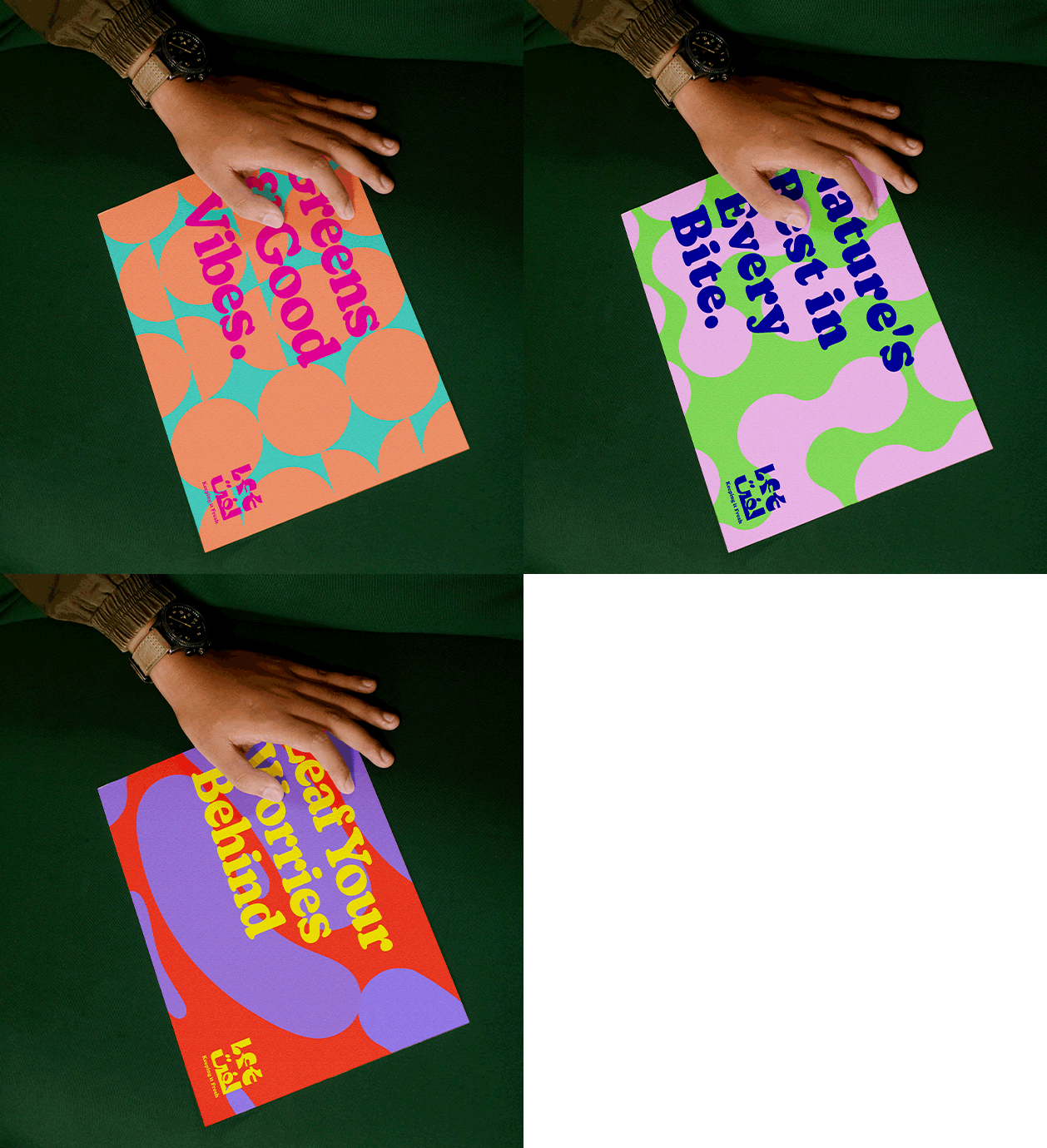
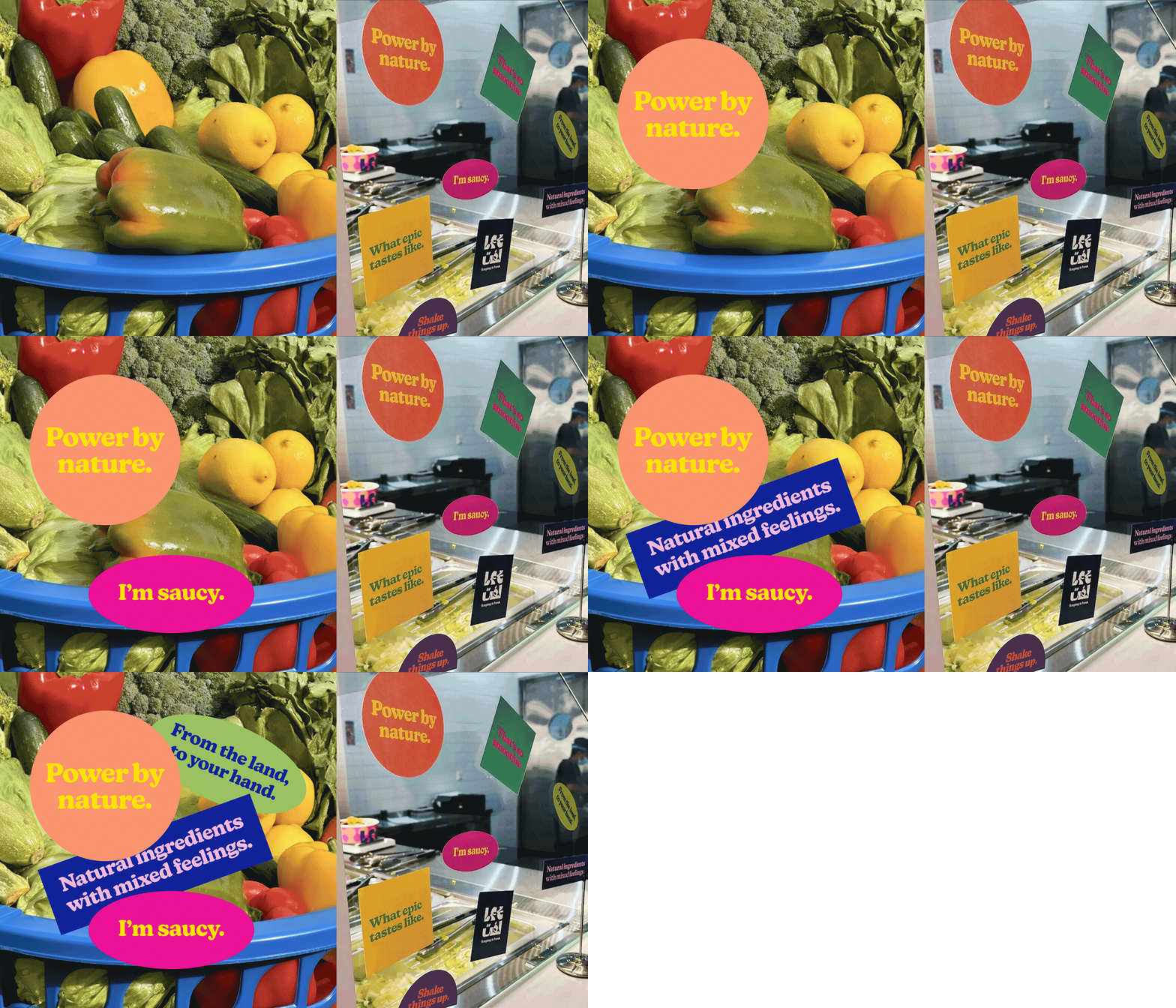
The verbal identity was an essential part of the brand, using trendy Gen Z sayings and food-related wordings to create a fun and relatable experience. Phrases like "I'm saucy" and "From the land to your hand" were integrated into marketing materials, in-store signage, and social media content, enhancing the brand's appeal and connection with its target audience.
Lft-OpenFile-11-3
Lft-OpenFile-13
Lft-OpenFile

The result is a dynamic, fresh, and fun brand identity that not only attracts and inspires its target audience but also sets a new standard in the neighborhood salad and juice bar industry.

Custom
Brand
Labs.

Get a tailored service and workshop
designed for your specific work culture. 

logotype-footer

 ©2022 Chemistry,
a proud part of Suheil Group.
View