Case Study
Kaun
A Universe Unfolded.
The custom wordmark bridges Arabic and Latin, drawing from Arabic typographic structure while forming readable Latin characters, creating a hybrid that feels powerful, fluid, and futuristic.
Supporting graphics were inspired by organic cosmic forms: galaxies, planets, stardust, and black holes; evolving into a rich visual language with color gradients and soft blurred shapes.
The system is bold yet ethereal, allowing the brand to flex across serious educational initiatives and inspiring cultural activities without ever feeling cold or institutional.

Designing a New Language for Space.
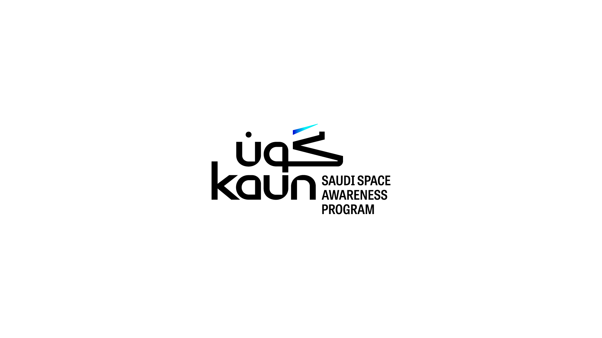
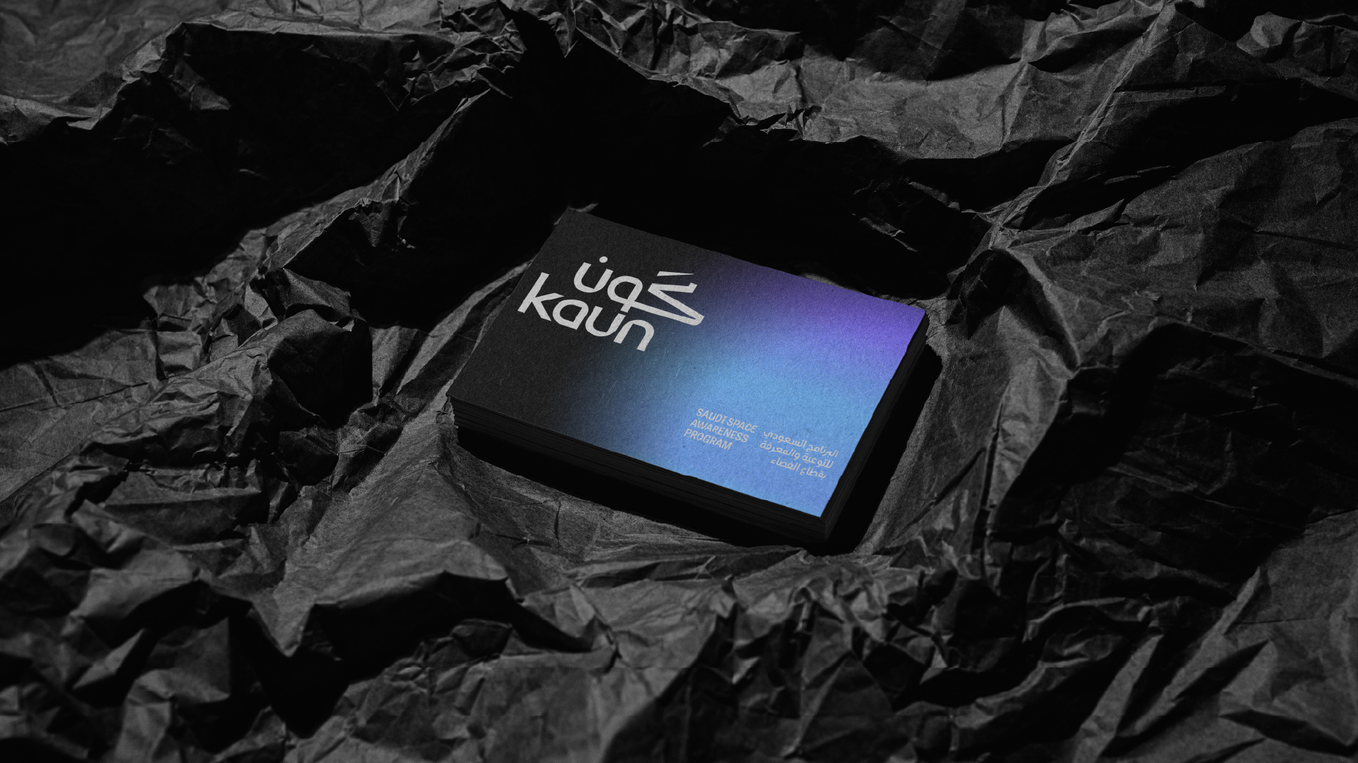
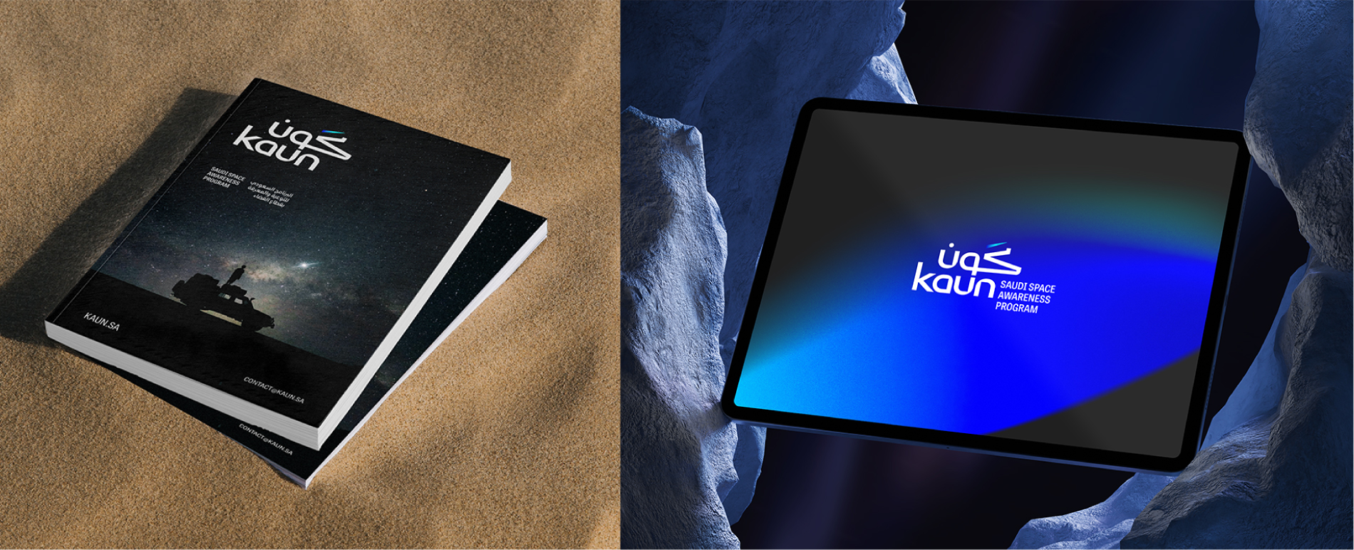
At the core of the brand, the custom KAUN logo seamlessly merges Arabic and Latin forms, symbolizing a bridge between culture and discovery. Its upward gesture and cosmic accents reflect ambition, exploration, and the limitless possibilities of space.
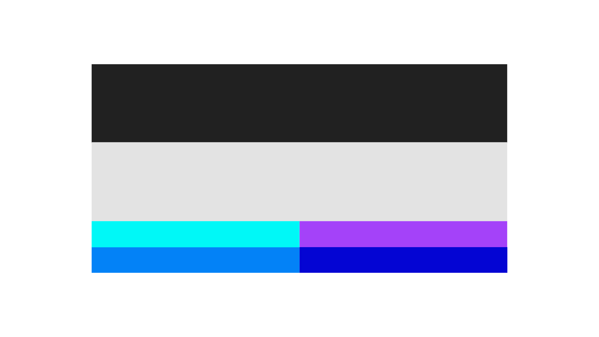
The color palette blends deep space blacks with vibrant cosmic gradients of blue, purple, and cyan, creating an atmosphere that feels infinite, dynamic, and full of discovery.
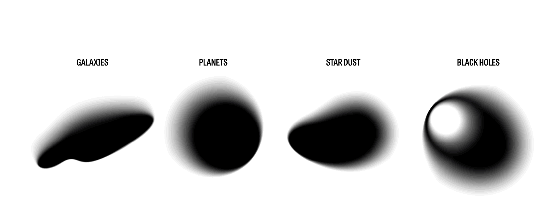
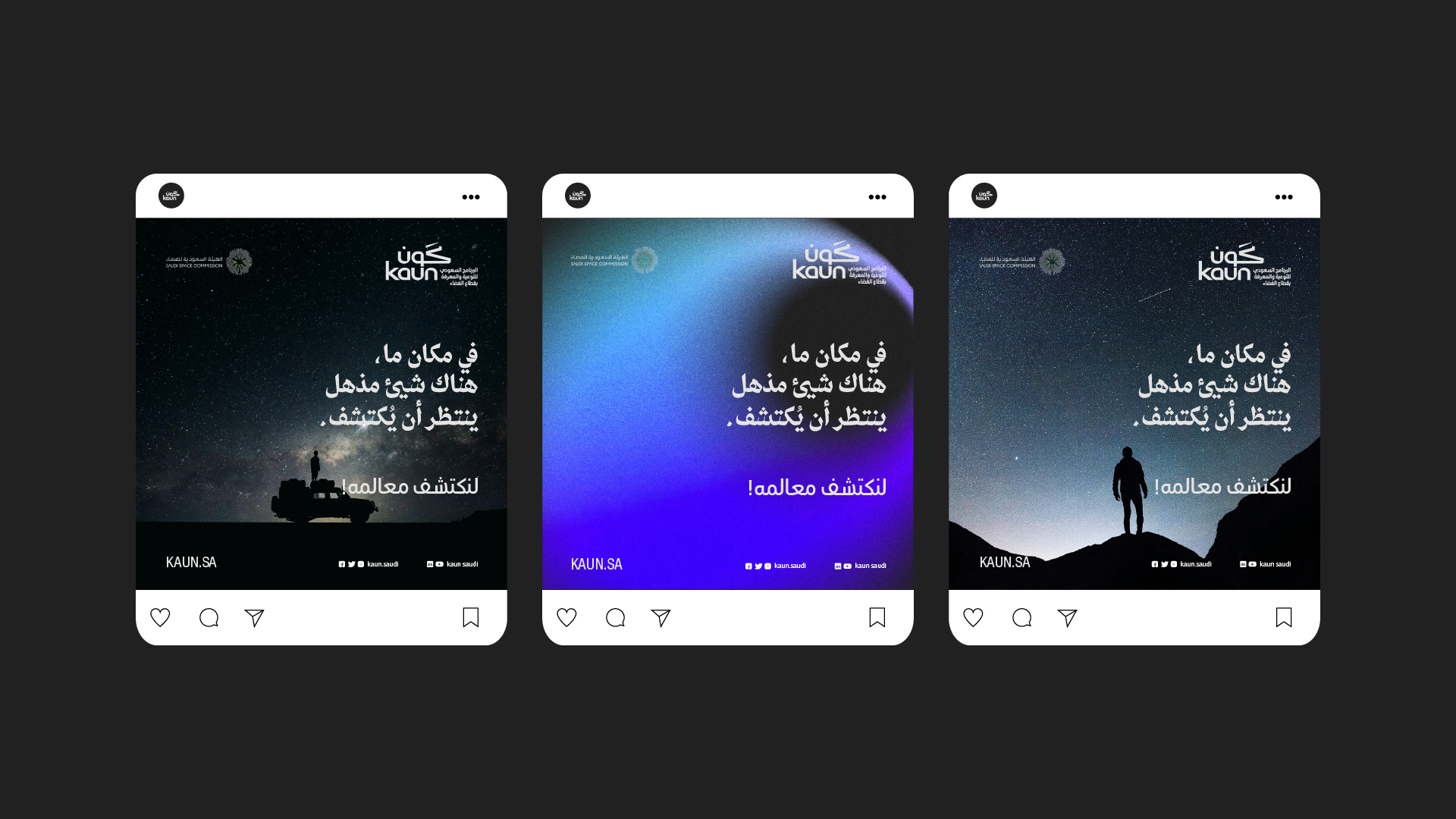
The visual language is built on the abstraction of astronomical phenomena. These elements blend our vibrant colors layered over a dark background, creating an atmosphere that feels immersive and otherworldly.
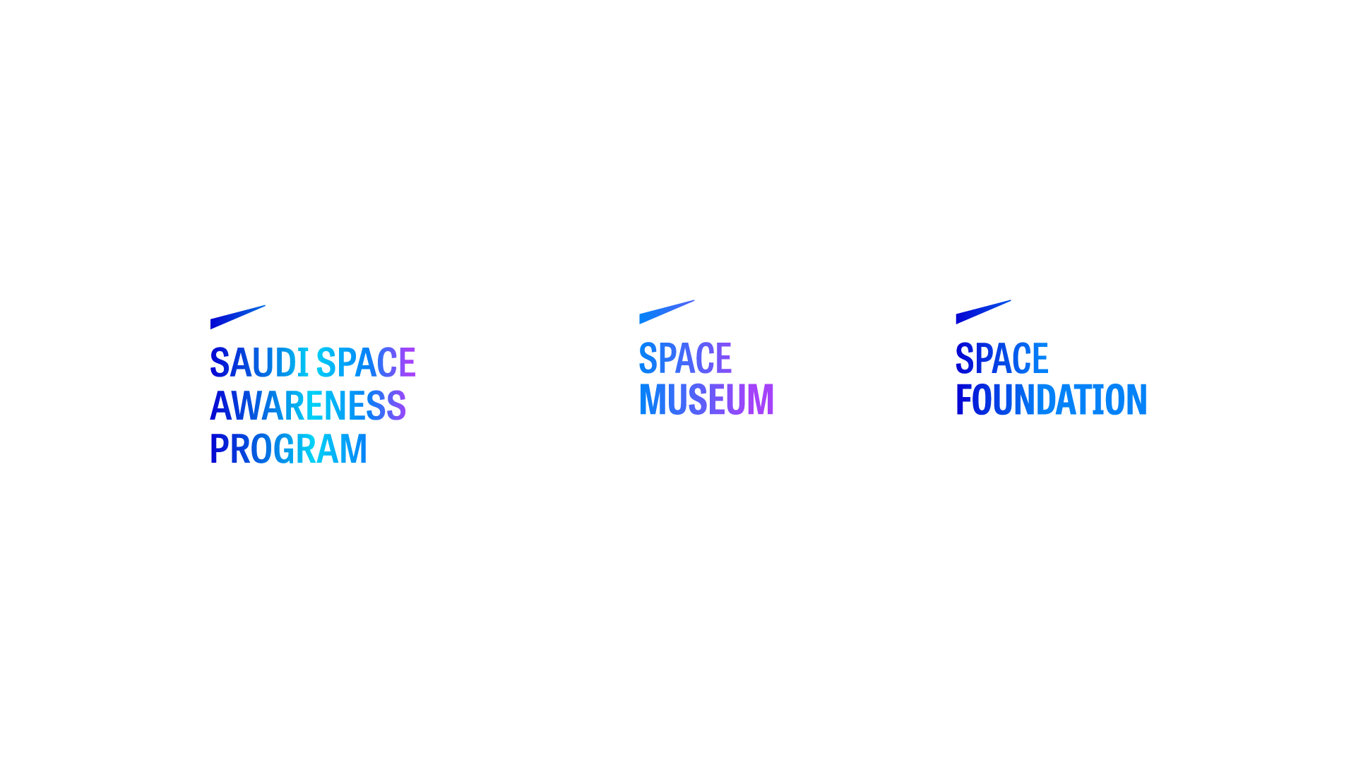
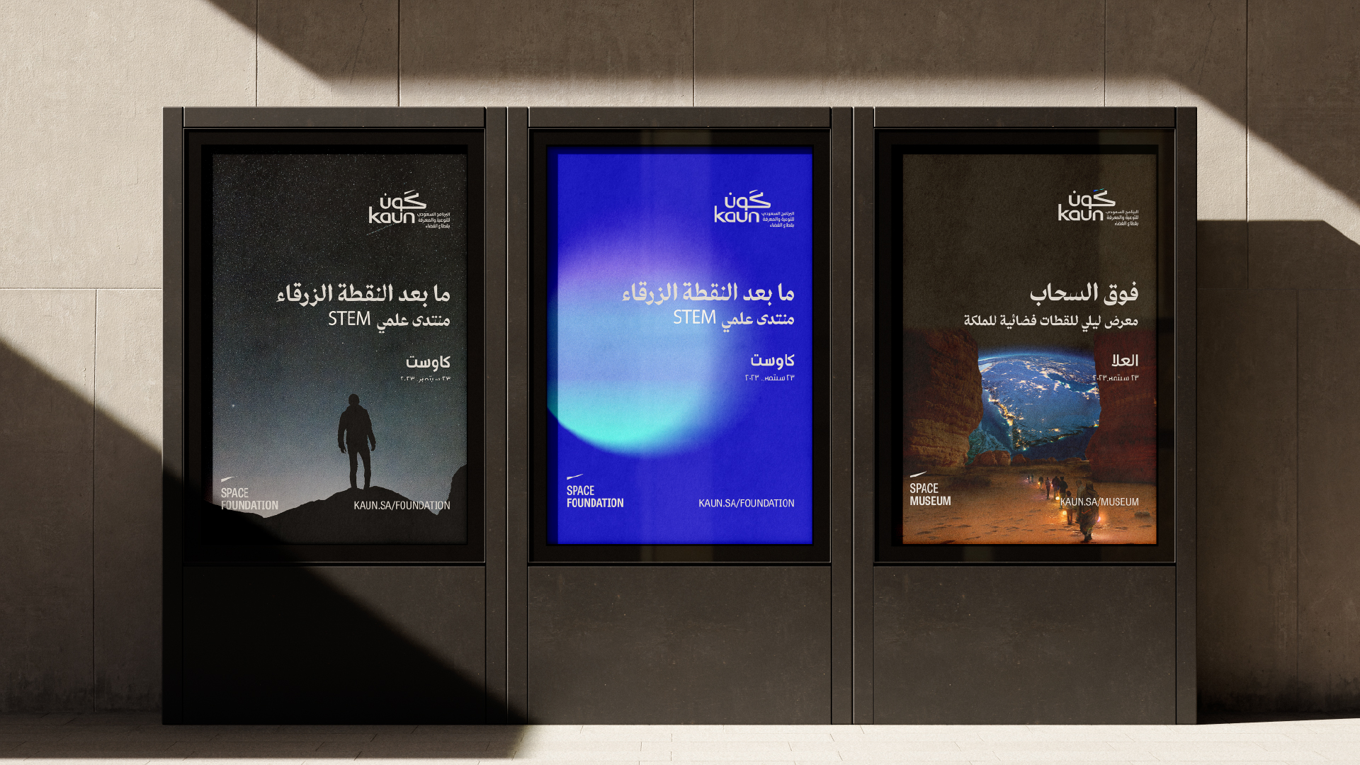
Each sub-initiative under KAUN, such as the Space Foundation and Space Museum, carries an adapted version of the core wordmark. Color variations differentiate each entity while maintaining a unified and cohesive brand system.
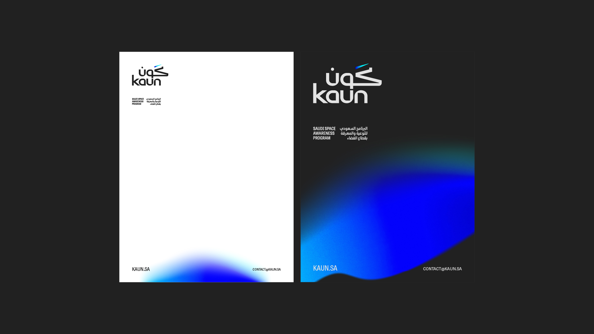
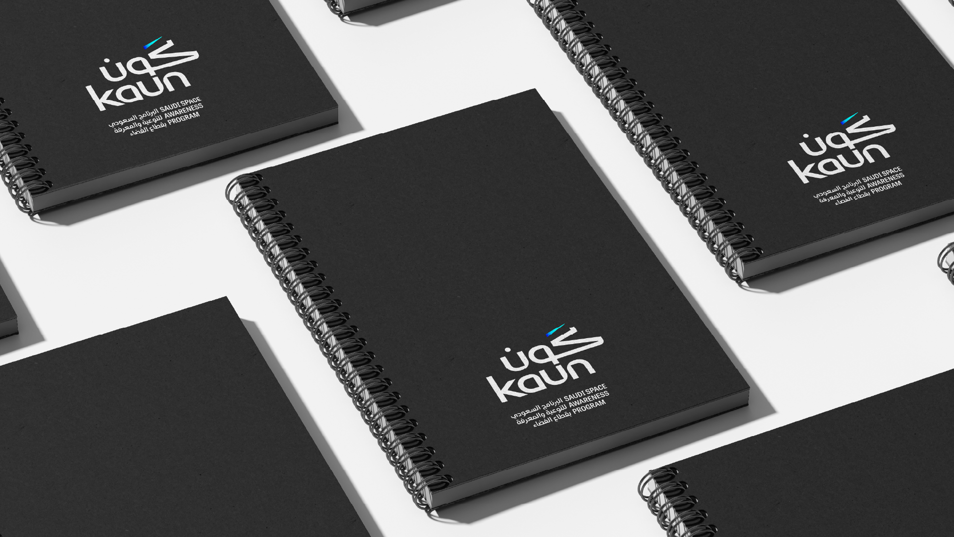
The stationery system, including letterheads, notebooks, and booklets, extends the brand’s cosmic language through subtle gradient touches and clean layouts. Minimalist yet vibrant, the applications balance official formality with the inspiring spirit of space exploration.
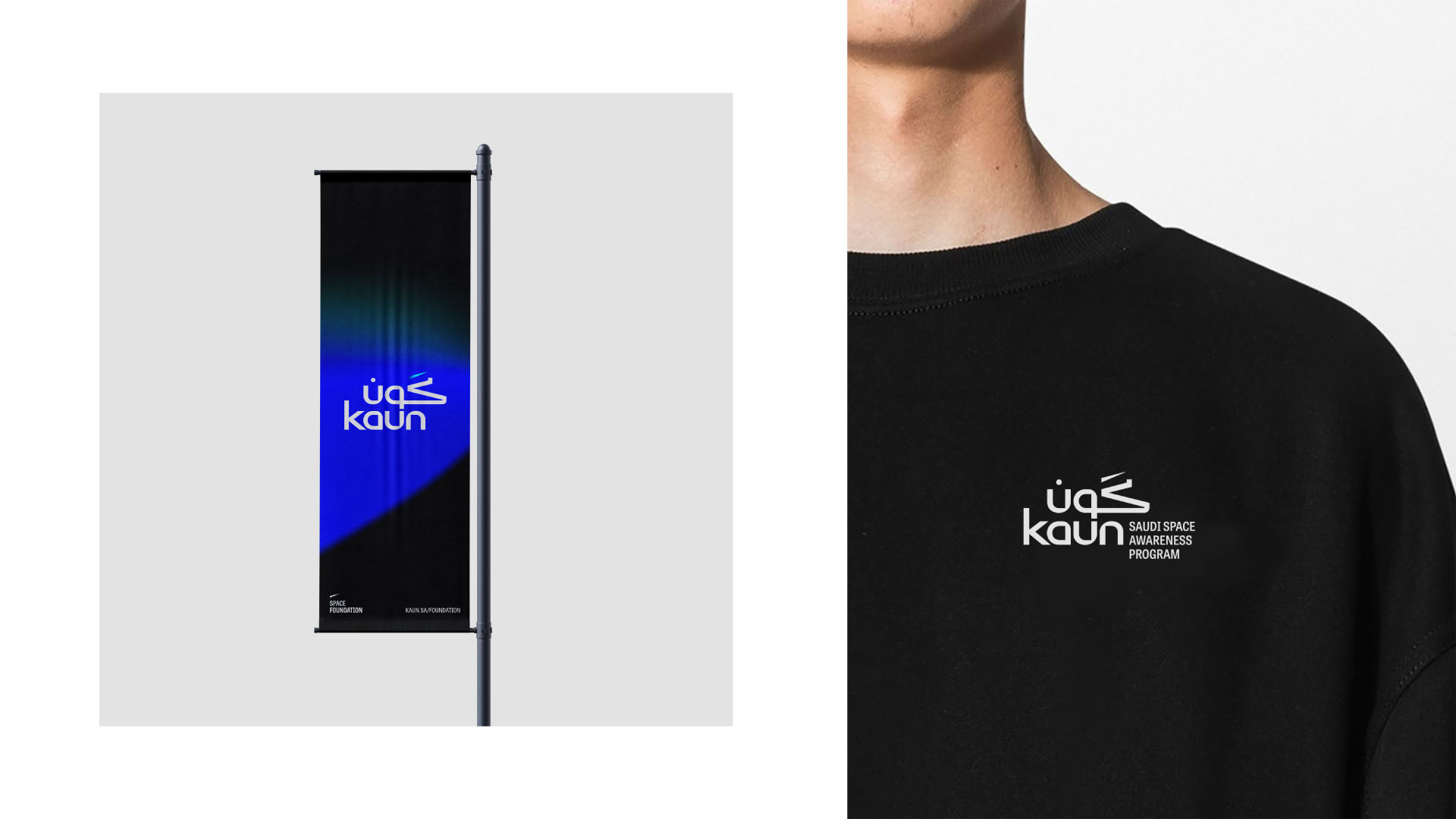
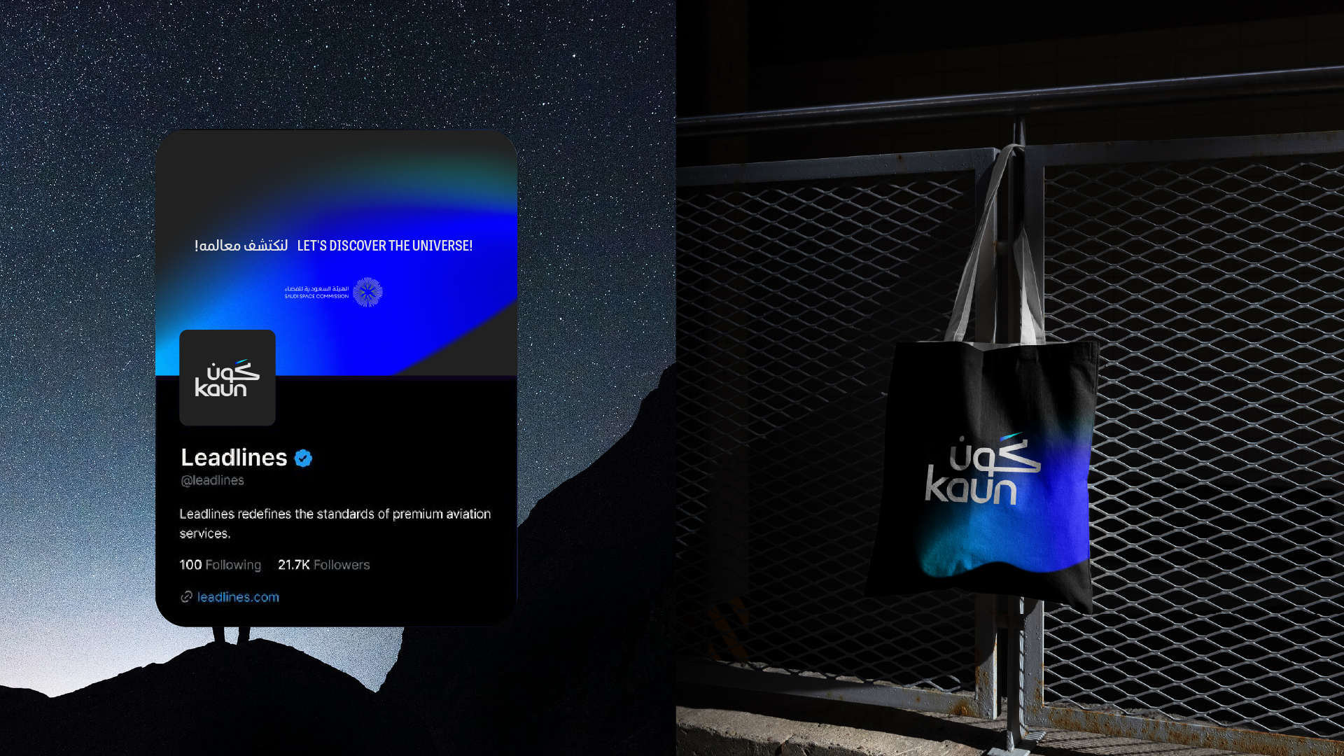
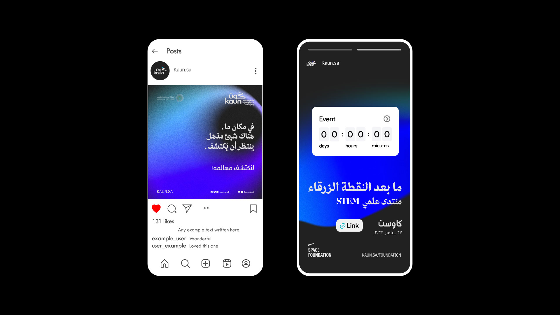
All communication materials, from social media posts to posters and event banners, carry the brand’s dynamic cosmic identity. Bold typography, vibrant gradients, and abstract space forms create a visually immersive experience that sparks curiosity and builds a strong, recognizable presence across all touchpoints.
Custom
Brand
Labs.
Get a tailored service and workshop
designed for your specific work culture.

©2022 Chemistry,
a proud part of Suheil Group.