Case Study
Al-Oula Arts Company
A Place for Contemporary Creativity.
The Challenge
Al Oula Arts Company set out to become a leading voice in the cultural and creative scene, celebrating both emerging and established artists. As a new initiative, it needed a brand identity that felt confident, modern, and rooted in cultural authenticity. The challenge was to build a bilingual brand that could flex across exhibitions, digital platforms, and public programming while also carrying the meaning of "Al Oula" (The First) with clarity and strength.
The Objective
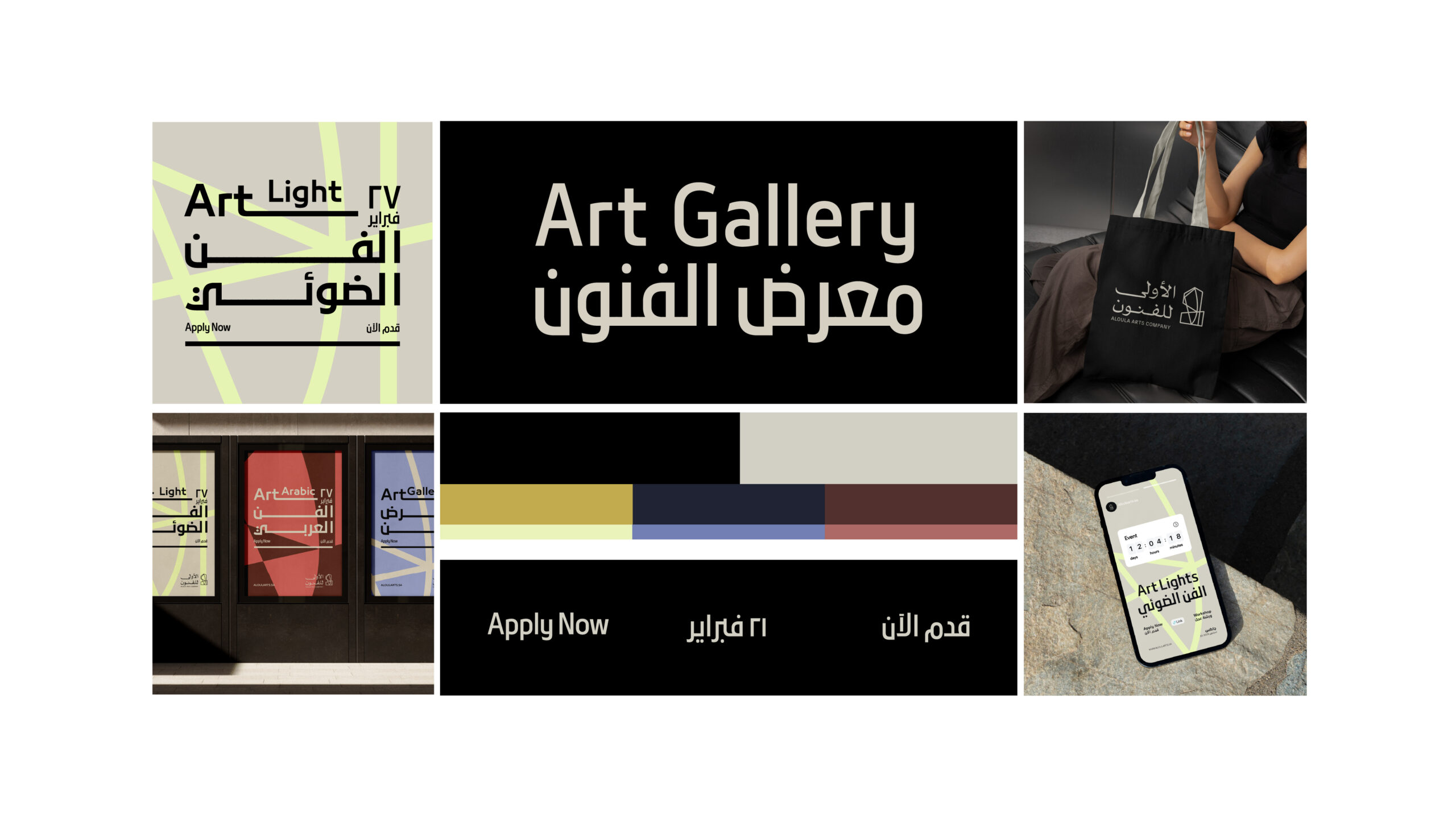
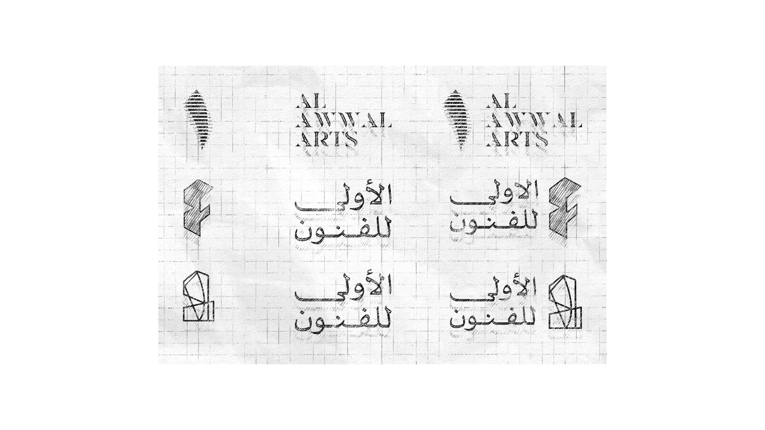
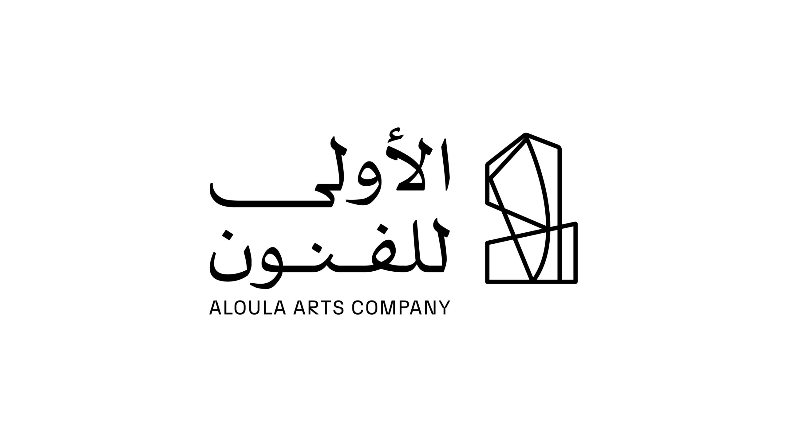
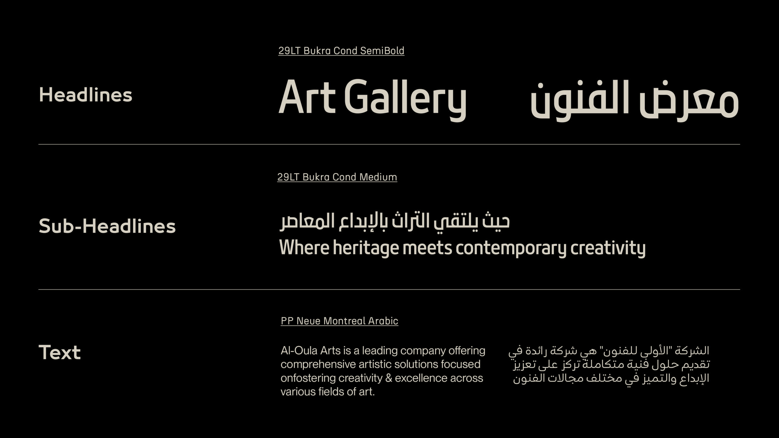
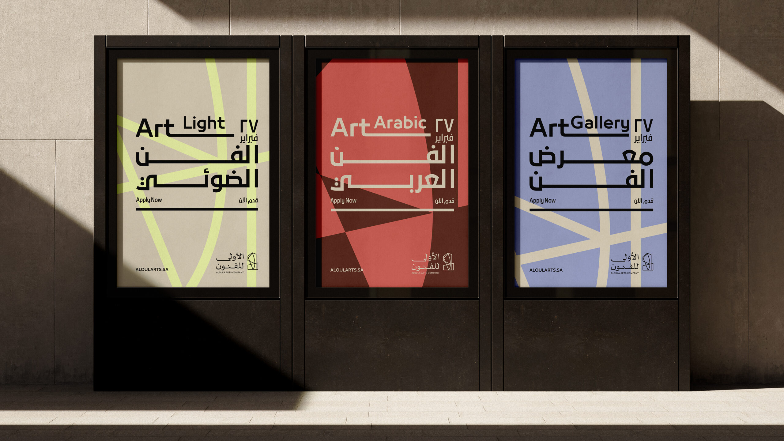
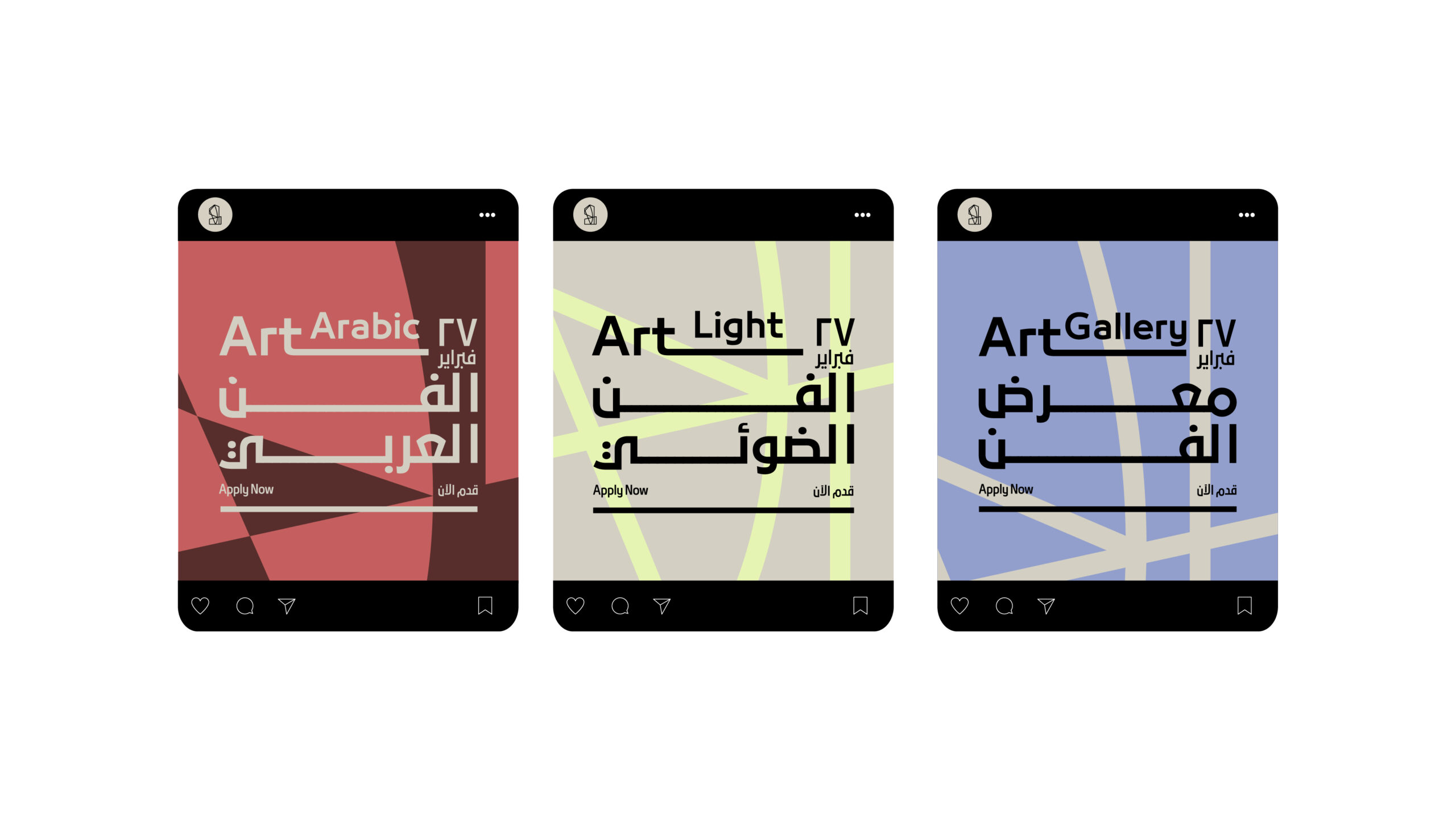
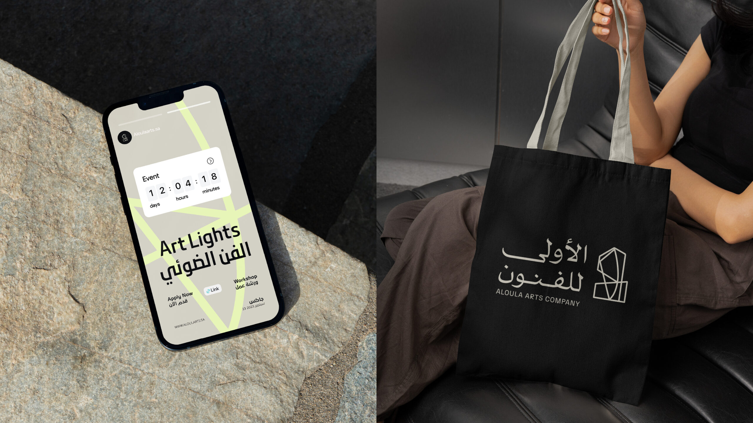
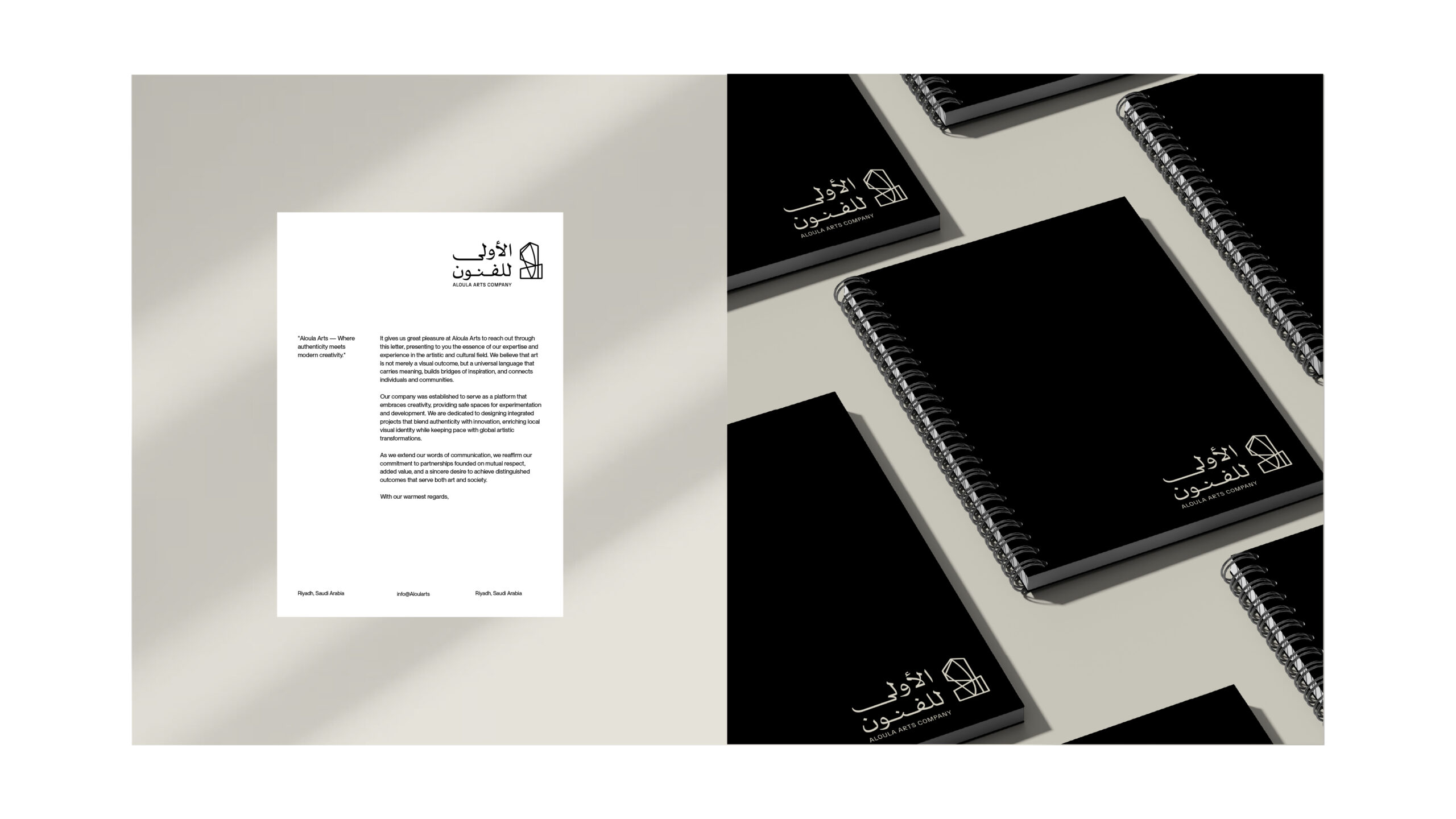
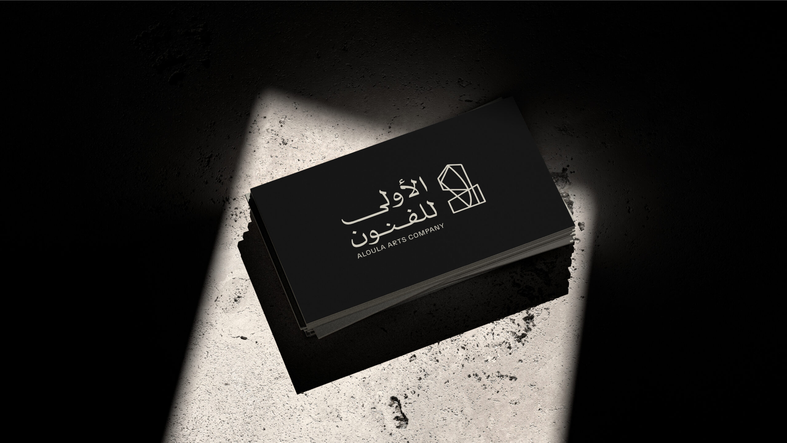
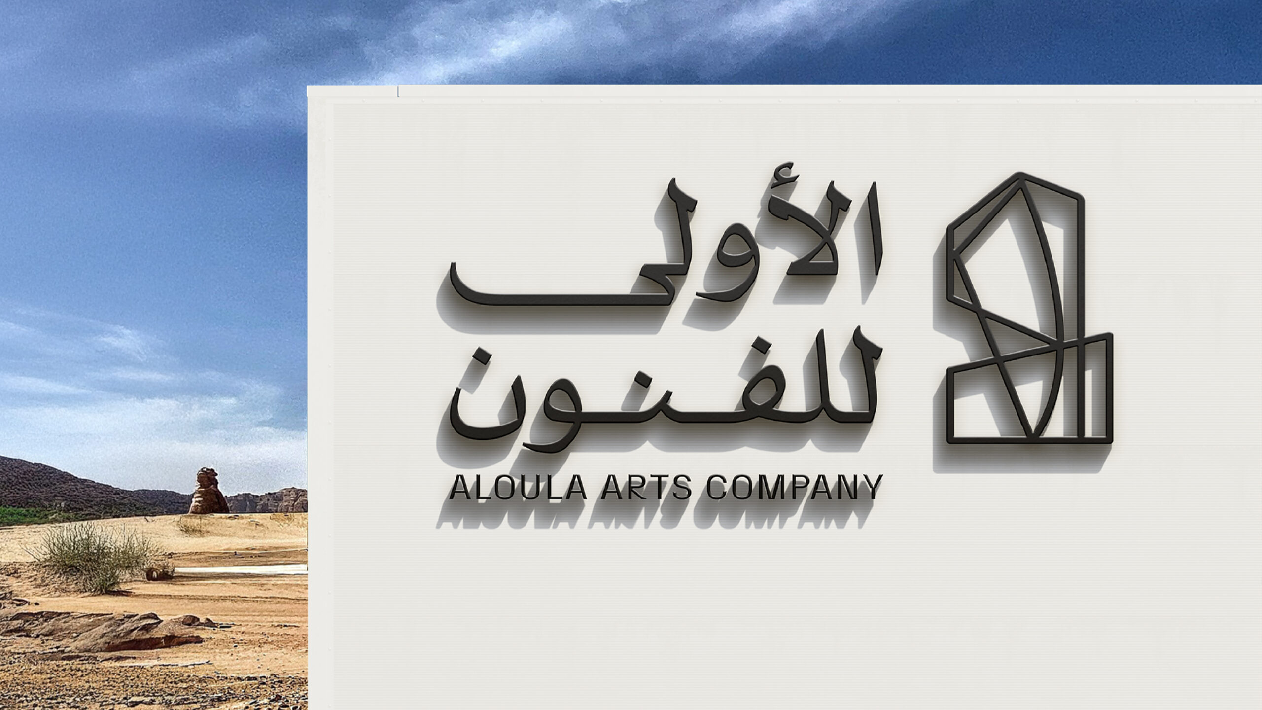
We developed a logo that integrates the concept of “The First” in both Arabic and English, creating a visual duality that’s both symbolic and contemporary. The icon is built from the Arabic numeral "1" and an abstracted geometric form, suggesting structure, creativity, and leadership. The typographic system was crafted to maintain balance and legibility across Arabic and Latin scripts, with strong visual alignment.
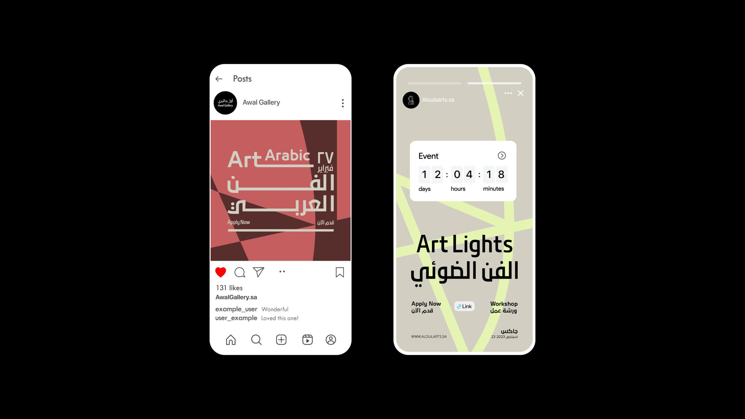
A vibrant yet grounded color palette was introduced to categorize various content types, supported by a custom graphic language that plays with layered lines and cultural abstraction. This visual rhythm allows the brand to shift between quiet elegance and bold expression, depending on context.
Solution
The brand system now lives across a wide set of applications, from exhibition posters and digital content to merchandise and event assets. The identity feels youthful yet credible, artistic yet structured able to support both experimental collaborations and institutional partnerships. Al Oula Arts is now equipped with a flexible, recognizable brand that positions it as a creative force in the region.
A Visutal Identity Rooted in Creative Leadership.

Custom
Brand
Labs.
Get a tailored service and workshop
designed for your specific work culture.

©2022 Chemistry,
a proud part of Suheil Group.