Case Study
Lead
The Art of Crafting Memories.

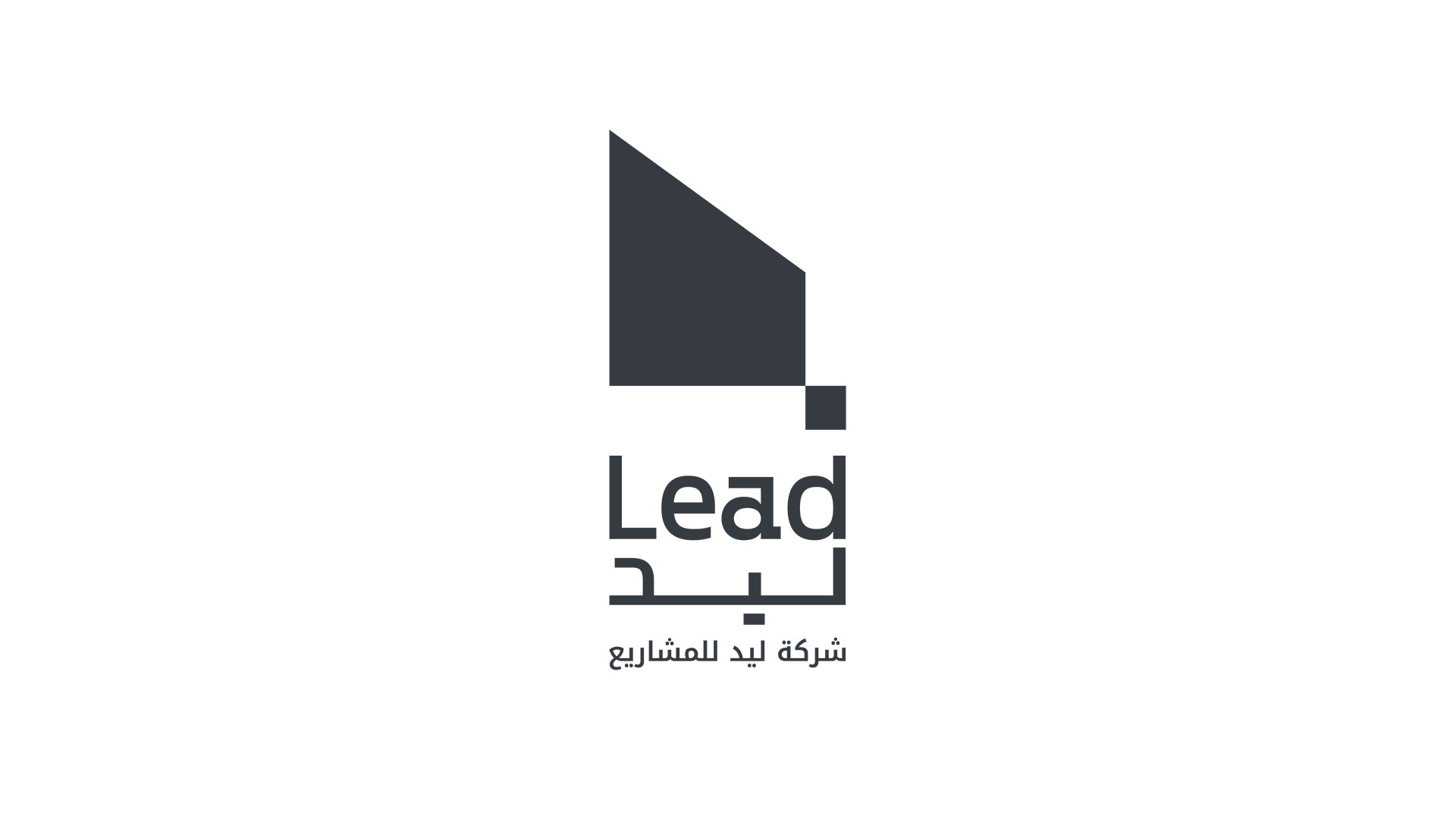
The rebranding process began with a deep understanding of Lead Project Company's core values and industry positioning. The new logo, inspired by the shape of a wood saw, represents the company's dedication to craftsmanship and precision in every project. This powerful visual metaphor highlights Lead's expertise in transforming raw materials into stunning, memorable event experiences.
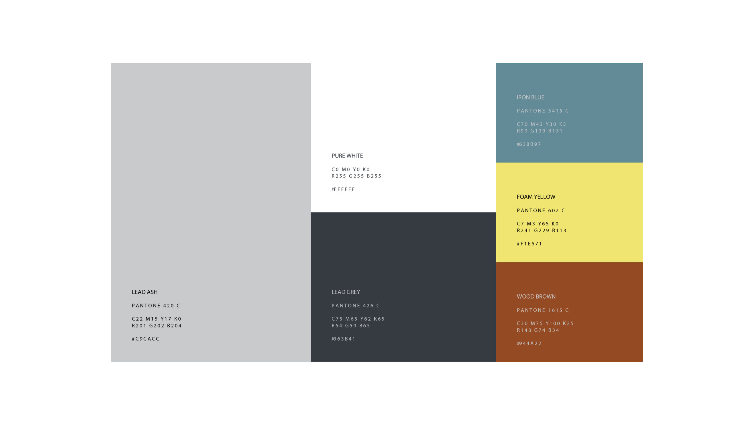
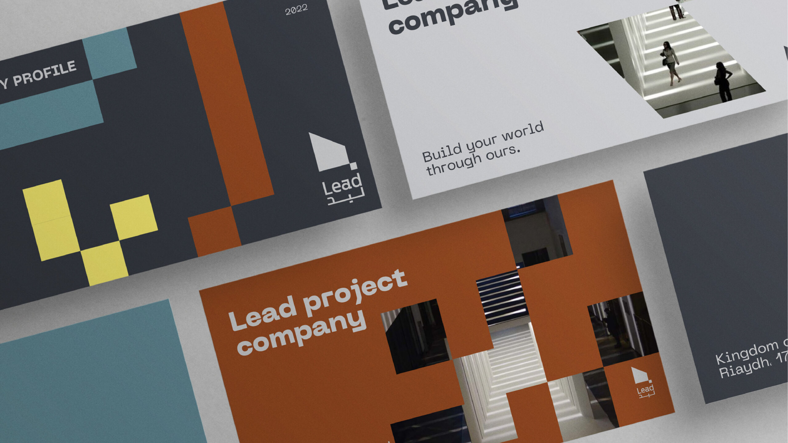
The chosen color palette of earthy tones like deep greys, rich browns, and vibrant yellows complements the woodwork theme, while also conveying professionalism and warmth. These colors create a strong visual identity that appeals to high-end corporate clients while maintaining an approachable and innovative image.
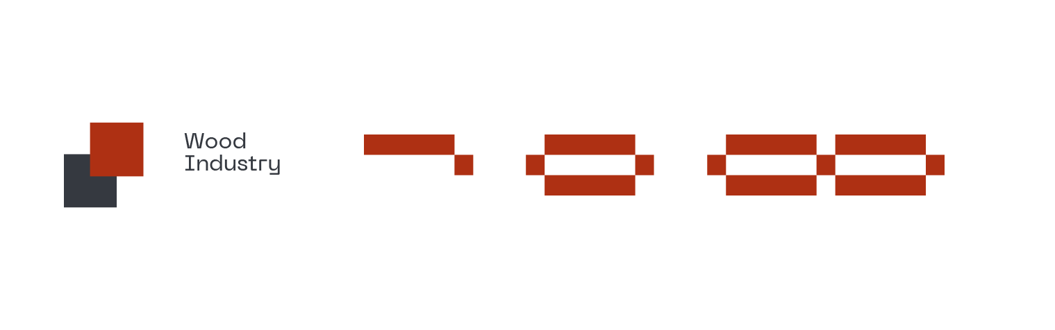
Woodcut patterns were incorporated into the branding to reinforce the company’s specialization in wood-based event production. These patterns add texture and depth to various brand materials, creating a cohesive and visually engaging identity.

Typography was selected to complement the structured, modern design of the logo.
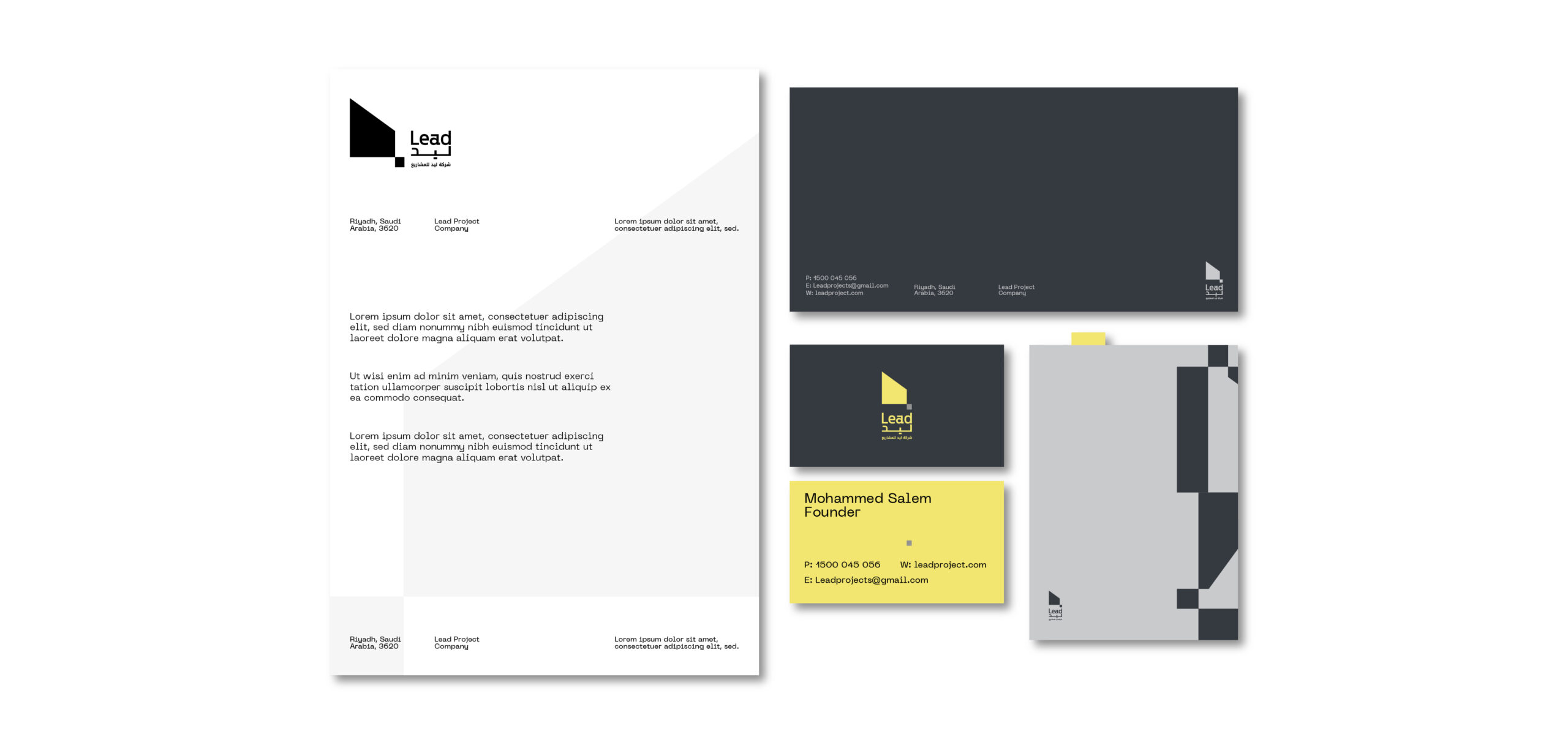
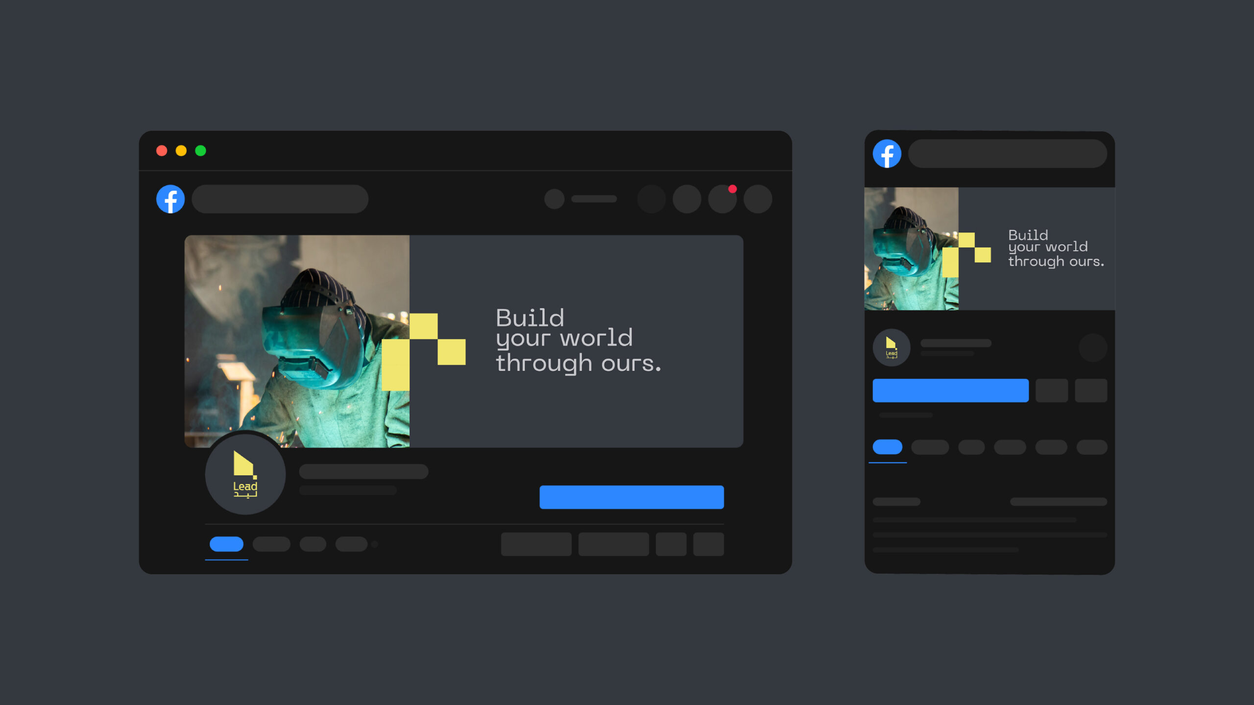
The visual identity extended across a full suite of branded materials, from business cards and stationery to digital presence and event collateral. Every element was meticulously designed to maintain consistency and reinforce the brand’s new positioning as a leader in wood-based event production.

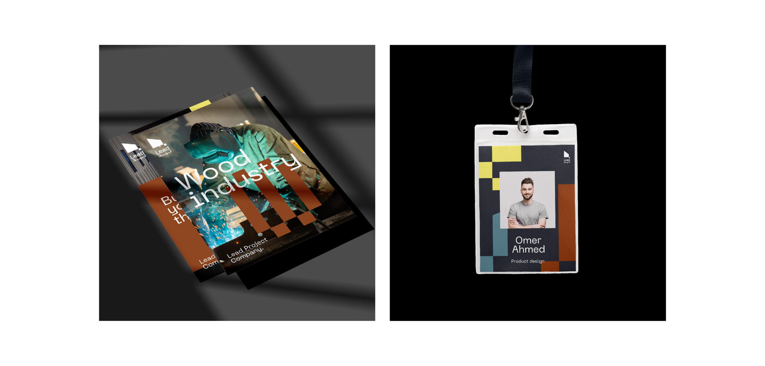
Digital and print applications of the new branding were carefully crafted to ensure that Lead Project Company’s message was consistently conveyed across all platforms. Whether in the digital realm or on-site at events, the brand’s identity remains strong, clear, and impactful.
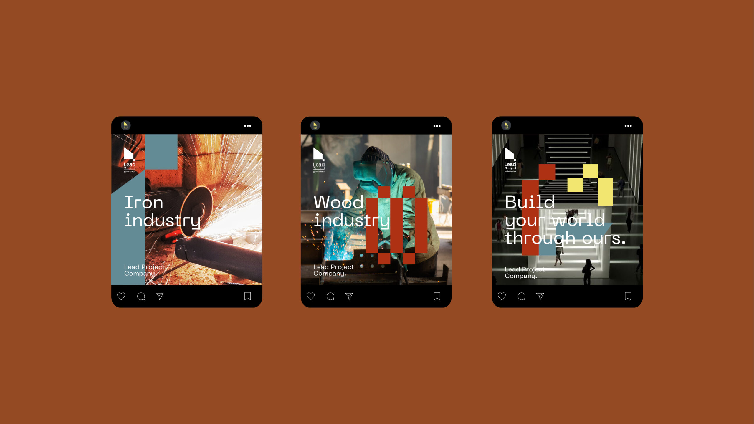
The new branding communicates the company’s dedication to crafting events that are not only meticulously planned but also memorable and impactful, with a unique focus on wood craftsmanship.
Custom
Brand
Labs.
Get a tailored service and workshop
designed for your specific work culture.

©2022 Chemistry,
a proud part of Suheil Group.